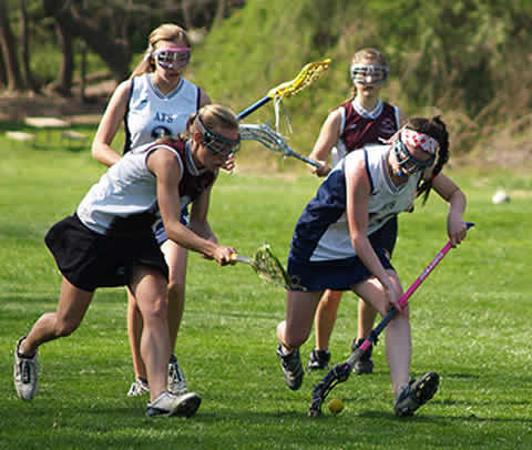
[ View menu ]

February 3, 2011

That wasn’t so great

Filed in Ideas
Subscribe to Decision Science News by Email (one email per week, easy unsubscribe)

GPS AND CHICKEN WINGS VS FLYING FIRST CLASS

This week, the Decision Science News editor talks about “premium experiences” and counter-evidence to the maxim that things don’t bring happiness.

I own a GPS but not a car.

When I travel, I look forward to getting into a rental, plugging in the GPS and finding the route to the hotel, the conference, or the local place with the best chicken wings. I get a strange pleasure of going to an arbitrary place like, say, Jacksonville, looking on Yelp to find the best place to find an arbitrary food, and then having the GPS guide me there. This is a true pleasure that technology brings me. It’s much better than driving while looking at scraps of paper or a crummy Avis map.

A noted behavioral economist and I were driving to a party once. Naturally, the conversation turned to the GPS. He shared my affection for them and pointed out another use, which is that you can give them to visiting relatives, who are then liberated and can drive themselves around and find their way back home again. He said that his delight in the GPS is unusual, however, as he finds disappointment in most things: especially espressos.

I thought about this a lot.

There is a common bit of advice which is to pay for experiences, not for things. I had always taken that for granted as true. Don’t be materialistic. Don’t pollute the world with needless junk. All that. But, I’m starting to realize that dollar for dollar, it often isn’t true, especially when dealing with premium experiences that are supposed to be great.

Take flying first class. A few years ago, when I first did it, it was great. A warm ramekin of nuts and a vodka tonic, sure, why not? But then, despite a bill that is sometimes $1000 higher, I’ve learned that a first class ticket: won’t get you into the lounge before your flight, won’t assure you your choice of meal (they run out), won’t get you your choice of drink, etc. On the first class flight I took last, the “meal” was a tiny bag of pretzels and a mint. (Guy behind me: “is there any other food?”. Stewardess: “no”).

When I think the supposedly premium “experiences” I’ve had, first class tickets, meals in fancy restaurants, etc., I have trouble remembering them, and those I do remember make me less happy than the $300 gadget that can show me the way to chicken wings nationwide. And when I summon the best experiences I’ve had, most were free.

There have been some comments about getting more specific about what is meant as an experience, and isn’t using the GPS an experience. So a clarification is in order:

With “experiences” I’m thinking of things billed as experiences in themselves: a fancy flight, a fancy meal, a theme park visit, a boat ride, a massage, an indulgence of one sort or the other. Granted, there are some great experiences (e.g. renting a canoe and spending the day on the Housatonic), but I’ve found in the past I’m quite ready to spend on experiences and deprive myself of material things when some material things (e.g. a GPS) are just an astonishing value as they lead to many, many feelings of satisfaction for the price of one supposedly great indulgence.

January 27, 2011

Correlation, causation and the Super Bowl

Filed in Gossip ,Ideas
Subscribe to Decision Science News by Email (one email per week, easy unsubscribe)

THE SUPERBOWL INDICATOR

Discussing the Decision Science News correlation, causation post during one of our daily and always entertaining Yahoo! Research lunches, someone said “this battle can’t be won because people just want to believe certain things are causal”. In line with that, Jason Zweig sends along this very funny piece about a spurious correlation, which, even though abandoned by its creators, refuses to die:

http://blogs.wsj.com/marketbeat/2011/01/28/super-bowl-indicator-the-secret-history/

Another nice side effect of last week’s post was this XKCD sent along by Winter.

Photo credit http://en.wikipedia.org/wiki/File:AmFBfield.svg

January 21, 2011

What can we do to defang bad science headlines?

Filed in Encyclopedia ,Gossip ,Ideas
Subscribe to Decision Science News by Email (one email per week, easy unsubscribe)

HOW TO STOP THE SELLING OF CORRELATION AS CAUSATION?

Decision Science News does not read news often. (We took Herbert Simon’s advice that checking the news every week or so is enough and are much happier since). However, each time we do we see headlines of the following sort:

Want to live longer? Get a grip! (On the correlation between longevity and hand grip strength).

If you want to live longer, then walk faster (On the correlation between longevity and walking speed).

If you’re reading Decision Science News, we don’t have to tell you that there’s not a scrap of evidence in the research cited in these articles that walking faster or giving firmer handshakes makes you live longer. See a target article to see it’s all correlational, not causal.

This is serious. First, it’s saying something that isn’t true. The news shouldn’t do that. They seem to get away with it by virtue of the fact that most people can’t conduct research themselves. (If they lied about testable relationships, e.g., “Want to avoid a ticket? Park on the sidewalk,” people would stop believing them rather quickly). Second, the effects are pervasive. We’ve seen PhDs in every field get suckered by a bogus headline.

(Speaking of headlines, DSN finds it hard to believe that anyone doing science journalism for more than a week wouldn’t fully grasp the correlation/causation distinction, if they didn’t have it already. Thus, we suspect there might be a strange relationship between people who write the stories and the people who write the headlines. We will check with our sister.)

It is handy that there is a Wikipedia article entitled Correlation does not imply causation, but how can people stand a chance against media machines that propagate new stories of this type every day?

A simple step is to prevent these stories from getting credibility with search engines by putting rel = “nofollow” in the URL when we ever have to link to such articles (as we have done above). But admittedly, that’s pretty weak.

Can we think of something better? This is 2011. We’re not at the mercy of a few media giants anymore. Online, people can exert a ot of collective power. What can be done about this? Maybe a browser plugin (like xmarks) that can overlay ratings on top of hyperlinks? A collective that keeps a kind of blacklist, perhaps punishing a publisher with less traffic each time they post such a headline?

What have you got?

January 14, 2011

The limits of behavioral economics

Filed in Ideas
Subscribe to Decision Science News by Email (one email per week, easy unsubscribe)

BEHAVIORAL ECONOMICS AS A COMPLEMENT, NOT A SUBSTITUTE


Sisyphus finds some nudges harder than others

George Loewenstein and Peter Ubel published this Op Ed in the New York Times entitled Economics Behaving Badly. It is not every day that prominent behavioral economists emphasize the limits of what they do, so we thought they deserved special mention here, (even if we are terribly late getting to this).

The article mentions some of the less-whelming behavioral economic interventions of late, and stresses that babies and bathwater need to be identified when rethinking existing systems.

Here is a representative quote:

Behavioral economics should complement, not substitute for, more substantive economic interventions. If traditional economics suggests that we should have a larger price difference between sugar-free and sugared drinks, behavioral economics could suggest whether consumers would respond better to a subsidy on unsweetened drinks or a tax on sugary drinks.

But that’s the most it can do. For all of its insights, behavioral economics alone is not a viable alternative to the kinds of far-reaching policies we need to tackle our nation’s challenges.

They mention that a program designed to reduce energy consumption by revealing neighbor’s consumption had modest effects of 1 to 2.5 percent. Since then, a working paper A working paper entitled Energy Conservation ‘Nudges” and Environmentalist Ideology: Evidence from a Randomized Residential Electricity Field Experiment by Dora L. Costa by Matthew E. Kahn, based on the same on the same study suggests that the effect can backfire as a function of the audience. Here’s the abstract:

“Nudges” are being widely promoted to encourage energy conservation. We show that while the electricity conservation “nudge” of providing feedback to households on own and peers’ home electricity usage works with liberals, it can backfire with some conservatives. Our regression estimates predict that a registered liberal who pays for electricity from renewable sources, who donates to environmental groups, and who lives in a liberal neighborhood reduces consumption by 3.1 percent in response to this nudge. A registered conservative who does not pay for electricity from renewable sources, who does not donate to environmental groups, and who lives in the bottom quartile liberal neighborhood increases consumption by 0.7 percent.

January 7, 2011

Five books that changed a statistician

Filed in Books ,Gossip ,Ideas
Subscribe to Decision Science News by Email (one email per week, easy unsubscribe)

GELMAN’S FIVE BOOK RECOMMENDATIONS

There’s a nice article in The Browser in which Statistician and Political Scientist Extraordinaire Andrew Gelman recommends five books. It is definitely worth a read. We learned something about baseball from it and have decided to buy a book on child rearing based on its recommendations. [We already knew the stuff about decision making, bien sur]

Since Andrew is a friend of the blog and  a notorious chart curmudgeon, we thought that for this post we would create a useful infotainmentgraphic, above, with which no reasonable person should find fault. We’ve subbed the Bill James Historical Baseball Almanac for the Annual editions from 1982-1986 because it is supposed to be Five Books, not Nine Books, but Five.

Without further ado, Gelman’s five. Again, don’t miss the article for the explanations.


The New Bill James Historical Baseball Abstract


Judgment under Uncertainty: Heuristics and Biases


How Animals Work


The Honest Rainmaker


How to Talk So Kids Will Listen and Listen So Kids Will Talk

ADDENDUM: With Andrew’s expert advice, we were able to improve the graphic a little:

ADDENDUM 2: I found some even better charts! Click to see full size.

December 31, 2010

SJDM newsletter is out

Filed in Conferences ,Jobs ,Research News ,SJDM ,SJDM-Conferences
Subscribe to Decision Science News by Email (one email per week, easy unsubscribe)

SOCIETY FOR JUDGMENT AND DECISION MAKING NEWSLETTER

Society for Judgment and Decision Making Newsletter Editor Dan Goldstein reports that the final SJDM newsletter of 2010 is ready for download.

http://www.sjdm.org/files/newsletters/

Enjoy!

December 24, 2010

Robyn Dawes 1936 – 2010

Filed in Books ,Ideas ,Profiles
Subscribe to Decision Science News by Email (one email per week, easy unsubscribe)

ROBYN DAWES, A FOUNDER OF THE JUDGMENT AND DECISION-MAKING FIELD

December saw the passing of Robyn Dawes, without question a scholar who helped define the research area of Judgment and Decision Making. The author of the pre-eminent course text “Rational Choice in an Uncertain World”, Dawes was no doubt responsible for getting and keeping many students interested in the field. Dawes was an excellent writer. In addition to authoring what we think is the best-titled paper in the history of JDM “The Robust Beauty of Improper Linear Models in Decision Making“, his books were some of the few we read without skipping a word from start to finish. Dawes is unique: a mathematical clinical psychologist (some say the only one), a past-president of the JDM Society, a fellow of American Academy of Arts and Sciences, an academic with no fear of controversy, and much more.

Here we reprint an obituary from the CMU website entitled Robyn Dawes Transformed Psychological Sciences Helped Found the Behavioral Decision Research Field. Note that there is still time to make plans to attend a memorial service in January.

PITTSBURGH—Robyn Dawes, the Charles J. Queenan Jr. University Professor of Psychology at Carnegie Mellon University who helped establish the field of behavioral decision research and made a significant impact in several areas of psychological sciences, died Dec. 14 at age 74.

“Robyn was an academic pioneer whose scholarship and leadership brought distinction to the university. His high standards and commitment to interdisciplinary teaching and research were deeply emblematic of Carnegie Mellon,” said CMU President Jared L. Cohon.

Dawes was one of the most distinguished researchers in behavioral science and significantly advanced the understanding of how people think, learn, judge and decide. Dawes was known for research in several areas, including characterizing the limits to judgment for experts and lay people, as well as the conditions that encourage people to cooperate with one another. He also became well known as a critic of clinical psychology practices not supported by empirical research.

“Robyn was a giant in the field of psychology, constantly pushing the boundaries and taking a fresh, innovative approach to real problems,” said John Lehoczky, dean of the College of Humanities and Social Sciences. “He helped create the area of behavioral decision research — an intellectual field that merged psychology and economic theory and that has since given us behavioral economics. His contributions to his research, Carnegie Mellon and his students are impossible to measure. His legacy will live on through the Department of Social and Decision Sciences, which he built.”

Dawes received his bachelor’s degree in philosophy from Harvard University in 1958. After taking a class in experimental psychodynamics, Dawes became interested in psychological problems from an empirical perspective. He attended the University of Michigan for his post-graduate work, earning a master’s degree in clinical psychology in 1960 and a doctorate in mathematical psychology in 1963. His first faculty appointment was at the University of Oregon, where he taught psychology and served as department head.

In 1985, Dawes joined the Carnegie Mellon faculty as a professor of psychology and head of the Department of Social Sciences. He embarked on establishing a core in decision-making, a discipline that his own research had helped to define.

“Robyn actually put the ‘decision’ into Carnegie Mellon’s Social and Decision Sciences Department, and his leadership and research set the stage for us becoming a world-class presence in this area,” said John H. Miller, head of the Department of Social and Decision Sciences. “His research gracefully transcended the social sciences, having major impacts on the fields of economics, political science and psychology.”

Dawes work in debunking myths and the views of self-proclaimed experts was based in the concern for humanity that motivated his research.  As a member of the National Research Council’s Committee on AIDS Research in the 1990s, Dawes fought the unfounded misconception that needle exchange programs — which can reduce the spread of HIV among intravenous drug users — promote drug abuse. In his book “House of Cards: Psychology and Psychotherapy Built on Myth,” Dawes called out mental health professionals for ignoring empirical research in favor of techniques that do not hold up to scientific inquiry.

Baruch Fischhoff, the Howard Heinz University Professor of Social and Decision Sciences and Engineering and Public Policy, was influenced by Dawes’ work when he was a graduate student in the early 1970s. Fischhoff later became Dawes’ colleague at Decision Research, in Eugene, Ore., and then at Carnegie Mellon. “Robyn was a great man, scientist and intellectual, who devoted his career to creating a psychology that makes the world a better place,” he said. “He was fearless in seeking the truth and in fighting those who would subvert it. He was a hero to those with the good fortune to know him.”

Dawes authored several books including “Mathematical Psychology: An Elementary Introduction,” one of the first text books on the topic, “The Fundamentals of Attitude Measurement” and “Everyday Irrationality: How Pseudoscientists, Lunatics and the Rest of Us Fail to Think Rationally.”

During the course of his career, Dawes earned many honors including the American Psychological Association’s William James Award in 1990 for his book “Rational Choice in an Uncertain World,” an induction into the American Academy of Arts and Sciences in 2002 and an elected fellowship to the American Statistical Association in 2006. In 2005, the American Psychological Society honored his lifetime of scientific contributions with a Festschrift, a collection of essays about his work written by colleagues from around the country.

Dawes is survived by his wife Mary Schafer; his two daughters, Jennifer Dawes of Pittsburgh, Pa., and Molly Meyers of Eugene, Ore.; two grandchildren, Kaylynn Meyers and Avery Meyers; and two cousins, Marcia Meadows of Mesa, Ariz., and Jane Hill of Eureka, Calif.

A memorial service is planned for Jan. 29, 2011, at the First Unitarian Church in Pittsburgh. Contributions may be made in Dawes’ memory to Transitional Services, Inc., 806 West St., Homestead, PA 15120.

For more information on the acclaimed career of Robyn Dawes, watch an interview with him that was made in conjunction with his Festschrift at http://video.google.com/videoplay?docid=-1321077408096928789#.

Photo credit: http://bit.ly/gxhloA

December 16, 2010

Area plots unmasked

Filed in Ideas ,R ,Tools
Subscribe to Decision Science News by Email (one email per week, easy unsubscribe)

RESULTS OF THE GREAT AREA PLOT QUIZ

If you are the type of reader who remembers things from last week, you may remember the great area plot quiz we had running.

This week, we are excited to announce that the results are in. The plot above shows answers to the four questions. The correct answers are indicated with the green lines. Remember, in each question, the big circle was area 1000 and readers had to guess the areas of the second and third biggest circles.

As the above plot shows, when the circles are 8% to 20% of the size of the biggest (questions 1 and 3), people exhibit a great deal of variation in their area estimates, but the responses benefit from some “wisdom of crowds” magic and approximate the truth. When the circles are 5% or 1% of the biggest, people tend to underestimate the area. It is also interesting to note that 1) the biggest variation in response is in the question with the biggest circle; this was a somehing surprise, since one would think it would be easier to visualize putting a biggish circle inside a little one, however floor effects can account for some of it 2) While the circles in questions 1 and 4 weren’t that different in area, people treated them somewhat differently. It seems as if in question 4, the fact the circle was third largest caused people to underestimate its size. Perhaps if it were second largest, it may have been spot on. The mean absolute deviations from the correct answer in Questions 1 – 4 were 38.6, 9.4,  73.6, and 31.2 respectively.

The following plot, which shows the difference between the responses and the correct answers, is also informative (and frankly, we couldn’t decide which one to lead with). It makes the underestimation apparent.

Hadley of ggplot2-authoring fame asked if we used “scale_area” to make our plots. Yes, we did.

p <- ggplot(plot.data, aes(num.contacts.sales.part1,response))
p <- p + geom_point(aes(size=count,alpha=.8)) + geom_line(size=.25)
p <- p + scale_area(to=get.range(plot.data$count))

where
get.range <- function(counts) {
dist <- counts/sum(counts)
my.range <- c(sqrt(min(dist)*100),sqrt(max(dist)*100))
my.range <- round(my.range,1)
}

Naturally, at this point, many R-hounds will want to play with the data. There are many things to try, such as computing the accuracy of the third circles on the assumption that the areas of the second circles are all correct. Far be it from us to stand in the way of such tinkering. Just paste the following into an R session to reproduce the data frame “df” with the responses.

df=structure(list(variable=structure(c(1L,1L,1L,1L,1L,1L,1L,1L,1L,1L,
1L,1L,1L,1L,1L,1L,1L,1L,1L,1L,1L,1L,1L,1L,1L,1L,1L,1L,1L,1L,1L,1L,1L,
1L,1L,1L,1L,1L,1L,1L,1L,2L,2L,2L,2L,2L,2L,2L,2L,2L,2L,2L,2L,2L,2L,2L,
2L,2L,2L,2L,2L,2L,2L,2L,2L,2L,2L,2L,2L,2L,2L,2L,2L,2L,2L,2L,2L,2L,2L,
2L,2L,2L,3L,3L,3L,3L,3L,3L,3L,3L,3L,3L,3L,3L,3L,3L,3L,3L,3L,3L,3L,3L,
3L,3L,3L,3L,3L,3L,3L,3L,3L,3L,3L,3L,3L,3L,3L,3L,3L,3L,3L,3L,3L,3L,3L,
3L,3L,3L,3L,3L,3L,3L,3L,3L,3L,3L,3L,3L,3L,3L,3L,3L,3L,3L,3L,3L,4L,4L,
4L,4L,4L,4L,4L,4L,4L,4L,4L,4L,4L,4L,4L,4L,4L,4L,4L,4L,4L,4L,4L,4L,4L,
4L,4L,4L,4L,4L,4L,4L,4L,4L,4L,4L,4L,4L,4L,4L,4L),.Label=c("q1","q2",
"q3","q4"),class="factor"),value=c(50,60,70,50,10,100,40,50,50,50,100,
100,100,50,50,111,100,150,10,250,70,65,100,200,100,100,100,40,100,20,
50,200,100,100,50,100,125,100,100,100,50,100,100,10,100,200,100,100,
63,100,100,100,80,10,50,80,50,125,50,300,100,50,150,50,5,5,7,5,2,10,1,
25,8,5,10,10,20,5,1,7,10,50,1,100,8,5,10,50,10,10,10,8,10,2,5,50,15,10,
2,5,16,10,25,10,5,10,10,1,10,25,10,25,6,10,10,10,12,1,10,10,5,30,5,100,
10,5,20,3,100,200,200,100,200,250,200,100,90,50,150,300,200,100,100,
250,250,300,100,400,120,120,250,300,250,200,250,200,200,40,100,400,130,
200,100,200,250,300,200,200,100,150,200,40,250,450,250,200,169,100,1,
250,200,50,200,160,200,250,100,400,300,100,300,100,10,50,40,25,20,125,
40,25,15,5,20,150,100,25,20,28,50,100,10,200,15,25,25,100,60,20,125,40,
40,4,10,100,25,50,10,20,63,30,50,50,10,50,50,10,60,200,50,50,42,10,0.1,
62,40,5,50,25,50,125,20,100,30,50,60,20)),.Names=c("variable","value"),
class="data.frame",row.names=c(NA,-256L))

If you want the correct answers (what we in JDM call the “normative” answers), just paste this, too.

df$norm=c(rep(78.4 ,nrow(df)/4),
rep( 11.2,nrow(df)/4),
rep(193.1,nrow(df)/4),
rep(50.9,nrow(df)/4))

December 10, 2010

Once again, chart critics and graph gurus welcome

Filed in Ideas ,R ,Tools
Subscribe to Decision Science News by Email (one email per week, easy unsubscribe)

HOW TO DISPLAY A LINE PLOT WITH COUNT INFORMATION?

In a previously-mentioned paper Sharad and your DSN editor are writing up, there is the above line plot with points. The area of each point shows the count of observations. It’s done in R with ggplot2 (hooray for Hadley). We generally like this type of plot, however, we are concerned about whether it gives people a good sense of the relative counts or not.

Ask yourself this:
1) If the area of the big circle represents 1,000 observations, how many observations does the second-biggest circle represent?
2) If the area of the second-biggest circle represents as many observations as you just said, how many observations does the third-biggest circle represent?

Write down your answers. There’s a form to enter them in below.

Now have a look at this one:

Same two questions:

3) If the area of the big circle represents 1,000 observations, how many observations does the second-biggest circle represent?
4) If the area of the second-biggest circle represents as many observations as you just said, how many observations does the third-biggest circle represent?

Kindly Record your answers here or use the embedded form below (if it is visible for you).

Watch this space for the exciting answer! If anyone has good ideas on presenting count information in a chart that relates an ordinal X and a continuous Y, please let us know.

December 3, 2010

Some ideas on communicating risks to the general public

Filed in Articles ,Ideas ,R
Subscribe to Decision Science News by Email (one email per week, easy unsubscribe)

SOME EMPIRICAL BASES FOR CHOOSING CERTAIN RISK REPRESENTATIONS OVER OTHERS

An example of an information grid

This week DSN posts some thoughts (largely inspired by the work of former colleagues Stephanie Kurzenhäuser, Ralph Hertwig, Ulrich Hoffrage, and Gerd Gigerenzer) about communicating risks to the general public, providing references and delicious downloads where possible.

Representations to use less often

Single-event probabilities as decimals or percentages

Statements of the form “The probability that X will happen is Y”, such as “The probability that it will rain on January 1st is 30%” are single-event probability statements. They are problematic not only for philosophical reasons (some “frequentists” (as opposed to “Bayesians”) say that such statements are meaningless), but also because they are ambiguous: they do not specify if we’re saying this about January First based on other January Firsts, or if we’re saying it based on all January Firsts at a particular weather station (or an average across many weather stations), or if we’re not even considering the date but basing our prediction on today’s weather, a mathematical model, an average of other people’s forecasts, our intuition, or what.

What may seem unambiguous is actually interpreted by different people in different ways. A survey of people in 5 international cities found no agreement on what a 30% chance of rain means. Some thought it means rain on 30% of the the day’s minutes, others thought rain in 30% of the land area, and so on [1]. A further problem with the statement is that it gives no information about what it means to rain. Does one drop of rain count as rain? Does a heavy mist? Does one minute of rain count?

In addition, when risks are described as probabilities, people tend to overweight small probabilities and underweight large probabilities. This observation shows up in the “probability weighting function” of Tversky & Kahneman’s Prospect Theory, the dominant behavioral model of gamble evaluations. A representation that leads to misperceptions of underlying probabilities is undesirable.

Conditional probabilities as decimals or percentages

Doctors given problems of the type:

The probability of colorectal cancer in a certain population is 0.3% [base rate]. If a person has colorectal cancer, the probability that the haemoccult test is positive is 50% [sensitivity]. If a person does not have colorectal cancer, the probability that he still tests positive is 3% [false-positive rate]. What is the probability that a person from the population who tests positive actually has colorectal cancer?

give mostly incorrect answers that span the range of possible probabilities. Typical answers include 50% (the “sensitivity”) or 47% (the sensitivity minus the “false positive rate”). The correct answer is 5%. [2]

It seems as if people given conditional probabilities, such as the sensitivity or the false-positive rate, confuse them with the posterior probability they are being asked for. This likely happens because each numerical representation lends itself to computations that are easy or difficult for that representation. The thing to do with the conditional probabilities listed above is to plug them into Bayes Theorem, which most people do not know. Even if they know the theorem, they have little intuition for it and cannot make good mental estimates.

Fortunately, there are other ways to represent information than conditional probabilities that allow even those who do not know Bayes’ theorem to arrive at the correct answer, as we shall see.

Relative risks

Relative risk statements speak of risk increasing or decreasing by a percentage, for instance, that mammography in women over 40 reduces the risk of breast cancer by 25%. But all percentages erase the frequencies from which they were derived. We cannot tell from the relative risk reduction what is the absolute risk reduction: by how much does the risk of breast cancer actually decrease between those who get mammographies and those who do not: the answer is .1%

Relative risk information does not give information on how many people need to undergo a treatment before a certain benefit is obtained. In particular, based on the relative risk information, can one say how many women must be screened before a single life is saved? If your intuition tells you 4, you are again far off, as 1000 women must be screened to save the one life. In this way, relative risk information can cause people to misjudge the effectiveness of treatments [3].

Representations to use more often

Natural frequencies instead of probabilities

Consider the colorectal cancer example given previously. Only 1 in 24 doctors tested could give the correct answer. The following, mathematically-equivalent, representation of the problem was given to doctors (also from [3]):

Out of every 10,000 people, 30 have colorectal cancer. Of these 30, 15 will have a positive haemoccult test. Out of the remaining 9,970 people without colorectal cancer, 300 will still test positive. How many of those who test positive actually have colorectal cancer?

Without any training whatsoever, 16 out 24 physicians obtained the correct answer to this version. That is quite a jump from 1 in 24.

Statements like 15 out of 30 are “natural frequency” statements. They correspond to the, trial-by-trial way we experience information in the world. (For example, we’re more likely to encode that 3 of our last 4 trips to JFK airport were met with heavy rush-hour traffic than encoding p = .75, which removes any trace of the sample size). Natural frequency statements lend themselves to simpler computations than does Bayes’ Theorem, and verbal protocols show that given statements like the above, many people correctly infer that the probability of cancer would be the number testing positive and who have the disease (15) divided by the number who get back positive test results (15 who actually have it + 300 false alarms). 15 divided by 315 is 5%, the correct answer. Bet you didn’t know you were doing a Bayesian computation.

Frequencies relative to a reference class

While compact statements of probability such as a “there is a 30% chance of rain on April first” save words, they do not reveal their underlying reference classes. When information is conveyed with statements like “In New York City, 3 out of every 10 April Firsts have more than a centimeter of rain” there is no ambiguity as to whether the 30% refers to days, area, or time, and it is more clear what “rain” means. It also conveys how you arrived at the forecast (an analysis of historic data, not a prediction based on a model).

Information grids

The Information Grid from the surprisingly popular Decision Science News post Tuesdays’ Child is Full of Probability Puzzles

Since probabilities can be translated to frequencies out of 100, 1000, 10000 and so on, they can easily be represented visually on grids that allow for visual assessment of area and facilitate counting. Research by my former office-mate Peter Sedlmeier [4] used information grids to teach people how to solve Bayesian reasoning problems (like the original colorectal cancer problem) by converting them into natural frequencies and representing them on a grid. Even six months later, experimental participants who received the information grid instruction were able to solve the problems correctly, while those who were instructed with the classic version of Bayes Theorem did not retain what they learned.

Information grids whose squares are embellished with faces showing positive or negative emotions have also proven effective in presenting treatment alternatives to patients [5].

Absolute risk reductions as frequencies

The statement that a certain treatment causes a 25% risk reduction, as mentioned, does not disclose the magnitudes of the risks involved. In the case studied, among women receiving mammographies 3 in 1000 died of cancer, while among women not receiving mammographies 4 in 1000 died of this cause. The absolute risk reduction pops out of this formulation, and we see it to be 1 in 1000. The number needed to treat, which is not computable from the relative risk reduction is now clear: to save one life, 1000 women must be screened. This formulation not only expresses the difference between alternative actions, but relates absolute magnitudes of risk as well.

The (probability) Distribution Builder of Goldstein, Johnson and Sharpe (2008)

Animations

While descriptive numerical probability formats leads to overweighting of small probabilities, recent research shows that when people learn probabilities through experience (actually taking draws from a distribution) it may lead to the opposite tendency: underweighting of large probabilities. An exciting possibility is that when descriptive and experienced probability formats are combined, the effects may cancel each other out. Other research shows that making draws from animated probability distributions led people to arrive at the most accurate estimates of the probability of a loss and of upside return of an investment [6]. Decision aids such as the Distribution Builder of Goldstein, Johnson, & Sharpe [7] allow participants to visually observe the magnitude of probabilities (as information grids do), while animating numerous draws from the distribution to allow people to experience random sampling. We propose to experiment with this format to see if it may lead to calibrated probability weighting.


The simulator of Haisley, Kaufmann and Weber


[1]

Gigerenzer, G. , Hertwig, R., van den Broek, E., Fasolo, B., & Katsikopoulos, K. V. (2005). “A 30% chance of rain tomorrow”: How does the public understand probabilistic weather forecast? Risk Analysis, 25, 623-629. Available online.

[2]

Hoffrage, Ulrich & Gigerenzer G. (1998). Using natural frequencies to improve diagnostic inferences. Academic Medicine, 73, 538-540. Available online.

[3]

Kurzenhauser, Steffi & Ralph Hertwig (2006). Kurzenhäuser, S., & Hertwig, R. (2006). How to foster citizens’ statistical reasoning: Implications for genetic counseling. Community Genetics, 9, 197-203. Available online.

[4]

Sedlmeier, Peter and Gerd Gigerenzer (2001) Teaching Bayesian reasoning in less than two hours. Journal of Experimental Psychology General, 130, 380–400. Available online.

[5]

Man-Son-Hing, Malcolm et al (1999) Therapy for Stroke Prevention in Atrial Fibrillation: A Randomized Controlled Trial. Journal of the American Medical Association, 282(8):737-743. Available online.

[6]

Haisley, Emily, Christine Kaufmann and Martin Weber (working paper) The Role of Experience Sampling and Graphical Displays on One’s Investment Risk Appetite. Available online.

[7]

Goldstein, Daniel G., Johnson, Eric J. & Sharpe, William F. (2008). Choosing Outcomes Versus Choosing Products: Consumer-Focused Retirement Investment Advice. Journal of Consumer Research, 35 (October), 440-456. Available online.