Which chart is better?
 Subscribe to Decision Science News by Email (one email per week, easy unsubscribe)
CHART CRITICS, GRAPHICS CURMUDGEONS, COME ONE COME ALL
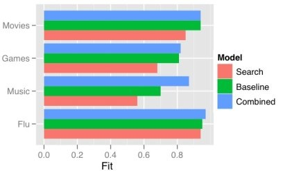
Once upon a time there was this graph (graph 1).
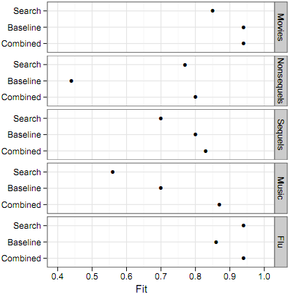
Andrew Gelman went all graphics curmudgeon on it, calling it an “ugly, sloppy bit of data graphics“, so it became this graph (graph 2).
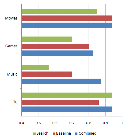
Now the question is, which is better: graph 2 or graph 3?
Please use the comments and logic. Thank you.
ADDENDUM
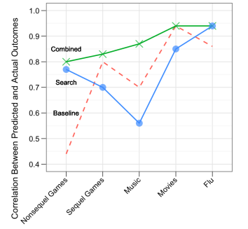
As a result of all the feedback here. The following chart was chosen for use in the publication (Proceedings in the National Academy of Sciences):
Photo credit: http://www.flickr.com/photos/emeryjl/2104152944/. Graphs 1 and 3 have four categories and graph 2 has five categories. Also, there is a missing label on graph 3’s horizontal axis. Assume you are deciding among graphs of these basic forms that have equivalent numbers of groups and identical axis labeling.


Sorry Mr Geldman, but I don’t agree. 😉
I think that graph 3 is better. The colour and the larger areas of the bars than of the dots means that you can see the relative size of the effect faster than with the dot-chart (chart 2).
Also people are generally more familiar with chart 3 than 2. Familiarity assists comprehension.
August 11, 2010 @ 9:03 am
Agree w/ above – I think 3 is better. I think going w/ the black and white theme and ggplot2 was an improvement.
August 11, 2010 @ 11:59 am
I think none of them are great, but number 1 might be the best of the lot. Improvements I’d make:
1. The category labels in the legend are closer to the bars than #3 (good!), but they’re not in the same order as the items in each grouping of bars (bad!). They should be in the same order, and better yet, the first instance of the actual bars should be labeled with the categories.
2. You’ve got an A, a B, and an A+B category. But you’re using red, blue, and green. That’s strange. You should use change the colors to be something like A=solid red, B=grey with black hashes, C=red with black hashes to get across the structure of your data.
3. Some additional sort of information about Fit would be useful. Units? What’s “good”? Perhaps a text label of “better” and “worse” next to the 1.0 and 0.4 labels?
You could do similar changes with graph 2. Perhaps draw a red line to the Y axis for the Combined case? I still prefer bars, though, cf Gelman.
August 11, 2010 @ 1:10 pm
Both have their strengths.
Chart 2’s x (horizontal) axis extends beyond 1 which is mostly annoying. Another issue with chart 2 is that if one wants to examine a specific attribute across categories (ie. ‘search’)it is rather difficult.
However, Chart 2 looks to be more ‘Tufte’-friendly, in the ink/data ratio sense and is black and white printer friendly. I have some clients where this is a huge perk.
All that said, I would probably end up cleaning up and using Chart 3 for my clients but use Chart 2 for when I’m analyzing the data and trying to understand the story.
August 11, 2010 @ 1:20 pm
3 looks nicer than 1, but I still prefer 2, because it emphasizes the meaningful patterns in the data better.
For example, the old wisdom about bar graphs requiring 0 in their range is relevant here. The Search bar for Flu is approx. 3x longer than the Search bar for Music, but that’s misleading, since the numbers are (approx.) 0.93 and 0.56 respectively, which is nowhere near a ratio of 3:1. But when you had such bars, as in Graph 1, it made the differences look a lot smaller and harder to compare.
So I prefer graph 2 for fidelity to the data, in terms of communicating the numbers accurately. The one downside of graph 2 is that is makes it harder to visually compare (e.g.) Search values to other Search values. But I think this is more of a question of what you’re trying to help the reader get out of the graph. You could easily re-arrange the categories to put all the Search values in one box (arranged by Music, Flu, etc.), if you wanted to facilitate those comparisons.
In other words, graph 2 could be improved on, in terms of highlighting a particular message in the data, but in terms of simple data fidelity (presenting the data clearly, not leading the reader to false impressions), I have to say that graph 2 is far and away better.
Final aesthetic point: not that this would be easy in ggplot2, but if you could get rid of those “box” outlines around the categories, (Music, Flu, etc.) in graph 2, it would be a lot less disturbing graphically. I think this is an example of Tufte’s “vibrations”.
August 11, 2010 @ 1:32 pm
Dan:
There’s a principle in decision analysis that the most important step is not the evaluation of the decision tree but the decision of what options to include in the tree in the first place.
I think that’s what’s happening here. You’re seriously limiting yourself by considering the above options, which really are all the same graph with just slight differences in format. What you need to do is break outside the box.
(Graph 2–which I think you think is the kind of thing that Gelman would like–indeed is the kind of thing that I think the R gurus like, but I don’t like it at all. It looks clean without actually being clean. Sort of like those modern architecture buildings from the 1930s-1960s that look all sleek and functional but really aren’t so functional at all.)
The big problem with your graphs above is that they place two logical dimensions (the model and the scenario) on the same physical dimension (the y-axis). I find this sort of ABCABCABCABC pattern hard to follow. Instead, you want to be able to compare AAAA, BBBB, CCCC, while still being able to make the four separate ABC comparisons.
How to do this? I suggest a lineplot.
Here’s how my first try would go:
On the x-axis, put Music, Games, Movies, and Flu, in that order. (Ordering is important in allowing you to see patterns that otherwise might be obscured; see the cover of my book with Jennifer for an example.)
On the y-axis, put the scale. I’ll assume you know what you’re doing here, so keep with the .4 to 1 scale. But you only need labels at .4, .6, .8, 1.0. The intermediate labels are overkill and just make the graph hard to follow.
Now draw three lines, one for Search, one for Baseline, and one for Combined. Color the lines differently and label each one directly on the plot (not using a legend).
The resulting graph will be compact, and the next step is for you to replicate your study under different conditions, with a new graph for each. You can put these side by side and make some good comparisons.
August 11, 2010 @ 2:34 pm
Hi, I prefer #2. It’s more precise and cleaner. However, if I were creating the chart for non-analysts, businesspeople or other innumerates, I’d go for #3 since it has the pretty colors thanks.
August 11, 2010 @ 2:38 pm
I like Andrew Gelman’s suggestion. I was going to suggest something similar, but with a different orientation — the models (Baseline, Search, Combined, in that order) on the x-axis, the fit on the y-axis, and points with connecting lines colored by category (Music, etc.). The similarity of patterns among the lines would then give you a sense of whether the Combined in generally better/as good across multiple categories.
August 11, 2010 @ 5:30 pm
I think the horizontal lines in #1 and #2 are unnecessary. There are only 3 groups in a panel, so you really don’t need the lines. The gray grid background on #1 in unnecessary and ugly.
Another thing you could do to improve #2 is to color the dots by group. It would makes comparisons between panels easier, but…
I like Gelman’s suggestion of a line plot. I ralso eally like labeling individual categories instead of legends. I am somewhat color blind, and color legends are very hard for me to follow. As an example, I can only read about 50% of USA Today’s graphics because their color legends are too similar (or small) for me too distinguish…
August 12, 2010 @ 2:48 pm
Among the three graphs, n°3 is the best one but as Andrew Gelman said: “.. are all the same graph with just slight differences in format”.
This is in fact, important, as graph n°3 is easier to read than n°1 because it presents the data in the same order than the key box (and in a better order, leaving “combined” in the third place); and it is easier to read than n°2 because bars give a better perception of the value of each characteristic, which is also helped by the use of distinct colors.
But for me it is also clear that the values should go on the y-axis, since that is what is measured (“independent” variable)
And the use of bars or of lines should depend on the use of the data…
August 13, 2010 @ 6:23 am
Can you post the data? (I know, it’s only 4, or 5 (depending on the graph) categories with 3 points in each)
@Harlan: Tufte doesn’t like hashes (for whatever that’s worth), saying they’re distracting. I’ve never been able to decide whether a color-mixing scheme (i.e. red=search, blue=baseline, purple=combined –this combination should work for red-green colorblind people, and of course you should have labels as well) would be intuitive to people or just too clever.
@Fernanda: there’s an argument for response variables on the y-axis, because most viewers are more used to that convention (cultural conventions cut both ways, though: exploded 3-d pie charts anyone?). I’ve noticed that many of the defaults in R’s lattice package put categorical predictors on the y-axis, which has the advantage that one can display long category names without having to use various uglinesses to avoid overlaps.
August 13, 2010 @ 3:09 pm
I find it interesting that people cite #2 as more precise when the data is presented with equal precision in #3…but what do I know, I’m simply a “business person.”
August 16, 2010 @ 4:49 pm
Hi Ben,
Here’s the data:
_,Flu,Music,Games,Movies
Combined,0.94,0.87,0.825,0.94
Baseline,0.86,0.7,0.8,0.94
Search,0.94,0.56,0.7,0.85
Note I just eyeballed it from graph 2.
Andrew – to clarify, these aren’t my data or graphs that I made (except 3, just for purposes of illustration). They’re from the working paper linked above. This post just exists to add to one of our long discussions about graphs here at Yahoo.
August 16, 2010 @ 7:09 pm
You are cutting off the X-Axis, it starts at 0.4 instead of 0.0
This is one of the worst errors people make when designing graphs. It inflates the actual differences between the values, misleading the viewer completely. This is practically the same if you are distorting actual figures in a table, only in a visual way.
Don’t ever do this. And I mean ever.
August 17, 2010 @ 9:56 am
Mike – Again, it’s not my graph. But your stance is controversial. Does anybody agree with Mike?
August 20, 2010 @ 2:43 pm
If graph n°1 and information about the data had not been presented, then I agree
August 20, 2010 @ 9:17 pm
It all depends. . . .
I like Figure 3, aside from the obvious improvements (e.g., the “fit” label, etc.). It’s relatively clear. I would prefer the legend to the right of the graph. But I have a friend who is fully color blind. It’s very rare, I know, but he can’t see a beautiful sunsets and wouldn’t be able to read Figure 3. So it depends.
I find Graph 2 far too busy. It took me noticably more time to interpret the information in that figure. Plus, dots tell me to look for two dimensions of measurement, such as in a scatter plot. Here the vertical dimension indicates just the category, which misled me for, well, about half a second.
One could change the organization and orientation of the information for a new graph , but what works “best” would depend on the intended message. In this case, it seems that we are supposed to compare the three methods within each category (i.e., movies, flu). Further, we want to compare the patterns of relationships among those methods across categories. In Figure 3, I can quickly see that the first three categories all have an increasing trend across the three methods, although the magnitude clearly differs. The results for Flu are very different. This seems somewhat consistent with the intended message in the original post. A display with all Search bars grouped together, say, might confuse that message. But again, it depends on the intention of its creator, of which I can only guess.
I disagree, by the way, about always starting at zero. I prefer the axiom, “never say never.” It depends on the content. In this case, maybe fits below .4 are essentially meaningless or never occur. For some measures of fit, the relevant value is actually its difference from 1.0, so .95 is twice as good as .90. There are many cases where the scale is entirely arbitrary or where 0 may not actually be included in the range. Finally, sometimes the relevant comparison point is not 0 but some measure of variability (e.g., the standard error). There are many reasons to exclude 0 from the axis.
Ultimately, then, for the comparison of these particular graphs, I was able to discern the likely intended message more quickly from Figure 3 than the other two.
August 21, 2010 @ 3:35 am
For the most part, I am in agreement with Mike, but, like Keith, never say never. It often depends on the data and situation. I would say that more often than not, the axis should start at zero as not to distort the data.
August 25, 2010 @ 3:41 pm
Yes, there may be some rare and odd instances where a value of zero is technically impossible and therefore not logical to present (e.g. percentage of body fat, where zero is just not possible in a living body).
But these examples are extremely rare.
For most data, the rule is upheld. If you cut off the axis (and not telling people about it!), you end up showing a column which is, for example, twice as long as another one and therefore indicating a difference of 100% between both values, when in fact the difference can be anything you make up – depending on whatever random number YOU choose to start your axis with.
It is a well known and very often used way of distortion and bias to trick people into thinking of huge differences when in fact there are very minor ones. Just open your average newspaper and look very closely. It gets even worse when there is no axis at all.
August 30, 2010 @ 10:31 am
There is no hard and fast rule about whether the axis should include zero. It is very often reasonable to omit. It depends on the variance of each sample mean and the variance across the points plotted.
When 9 lines are greater than .5, exhibit variation between .55 and .95 (as above), it is not a good idea to include zero. Think about it, once could just plot 1 – data and make a handsome plot that doesn’t include what was formerly zero. Since that’s it unobjectionable, it does not make sense to categorically include zero.
The audience must also be kept in mind. A scientific journal is not USA Today. A competent researcher will realize that overt attempts to fool people with axis labelling will do more harm than good.
August 30, 2010 @ 2:35 pm
Several of you have discussed whether a graph must begin at zero but no one except Scott J. has acknowledged that the type of graph makes a difference. One judges the length of a bar to read the values in a bar graph. Any length begins at zero. Therefore, any bar graph must begin at zero or is a visual lie. Some say they judge a bar by the position of the end but they cannot help but to see the length of the bar as well. On the other hand, the dots in graph 2 or the lines in the line graph are judged by their position along a scale. This position does not depend on where the origin is. Therefore, the dot plot and the line graph may begin at 0.4 for an intelligent audience who can be expected to read the scale. I discuss this in more detail in Chapter 7 of Creating More Effective Graphs. So Keith and Dave, I say “never” to bar charts. If you want to omit zero, use a dot plot or other type of chart.
Several of you mentioned readers who have color vision deficiencies. When using color, it is often useful to vary markers or other graphical elements as well as was done in the line graph. There is a useful utility at www. vischeck.com that lets you test how readers with different types of color vision deficiencies would see your figure. I ran these charts through it and found that tritanopes would have trouble distinguishing the blue and green in charts 3 and the line graph. The markers solve this problem for the line graph. I realize that tritanopes are not as common as deuteranopes (often called red-green color vision deficiency) but why not choose colors that as many as possible can distinguish.
September 8, 2010 @ 2:56 pm
Too bad that line graphs are supposed to be reserved for continuous data, making them inappropriate here.
September 8, 2010 @ 3:56 pm
I would have preferred a version of chart 2 with three dots (with different colours) per category (movies, etc.).
I would have then ordered the categories by “baseline” value (or “combined”, depending on the meaning of these values).
September 10, 2010 @ 2:26 pm
How about using a RADAR CHART? I believe putting the categories as axes and marking models with different colors will be much easier to understand than all graphs listed above.
September 10, 2010 @ 7:10 pm
Looking at the figure chosen for publication, why are lines differentiated by line type (dashed or solid), as well as by point type (cross, filled circle) and colour?! To top it off, the lines are each labelled directly on the chart…
Granted I think having the lines labelled is insufficient alone (not just for ease of viewing but also because the lines intersect) but to have colour, point style and line style varied by group is a bit ridiculous imo…
What ya think?
September 16, 2010 @ 6:38 am
[…] Andrew is a friend of the blog and a notorious chart curmudgeon, we thought that for this post we would create a useful infotainmentgraphic, above, […]
January 7, 2011 @ 12:32 pm
And what’s about realtime 3D bar-chart? Like this: http://www.parsec.hu/Chart/
Unfortunatelly you cannot see any value until you move the mouse over a bar…
June 3, 2011 @ 11:46 am
Thanks for your blog post. I would also like to say that a health insurance specialist also utilizes the benefit of the actual coordinators of your group insurance coverage. The health insurance agent is given a listing of benefits desired by a person or a group coordinator. Such a broker can is find individuals or coordinators that best go with those demands. Then he reveals his suggestions and if the two of you agree, the actual broker formulates binding agreement between the 2 parties.
December 18, 2012 @ 7:08 pm
I really like your writing style, fantastic info , thankyou for putting up : D.
December 18, 2012 @ 7:19 pm