Chances of going to college based on parent’s income

INCOME PERCENTILES AND INCOMES PAINT DIFFERENT PICTURES
The amazing team at the New York Times have a “You Draw It” feature in The Upshot in which readers try their hands at drawing a graph. The graph should show the probability of a child going to college based on their parents’ percentile in the income distribution.
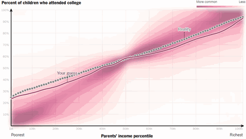
As a cool added feature, after people took their guesses, they could see, in shades of red, the other guesses people had taken and compare it to the actual graph.
SPOILER ALERT: You can see the true answer at the bottom of this post. If you want to try your hand at guessing, click through to the NY Times and guess before proceeding.
One way to interpret this relationship is that for every percentile increase in parental income, the probability of college enrollment increases by a constant amount, which might seem somewhat surprising. Even the NY Times editors were surprised by this linear relationship, and the data they collected showed that other people were, too.
Jake Hofman and I wondered “what if people didn’t take the X-axis literally, what if they thought about it as something like log income or income (instead of percentile in the income distribution)?” Percentiles are tricky. They’re buckets with equal numbers of people, but those people can have very different incomes. What would the graph look like if the X-axis were income? Would this relationship be more intuitive to readers?
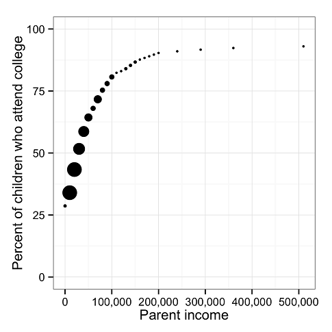
Jake scraped some income percentile data from whatsmypercent.com and we eyeballed the probability data from the chart at the NY Times. This enabled us to look at the probability of going to college based on income, which tells somewhat of a different story. In these plots, the size of the each point corresponds to the number of people in it.
The change you get by adding $10,000 a family’s income matters considerably for those earning between $10,000 and $100,000 (which the vast majority of Americans do), and matters much less outside that range. At the same time, it’s considerably more difficult for lower income parents to increase their income by this amount.
Probability of going to college vs log income:
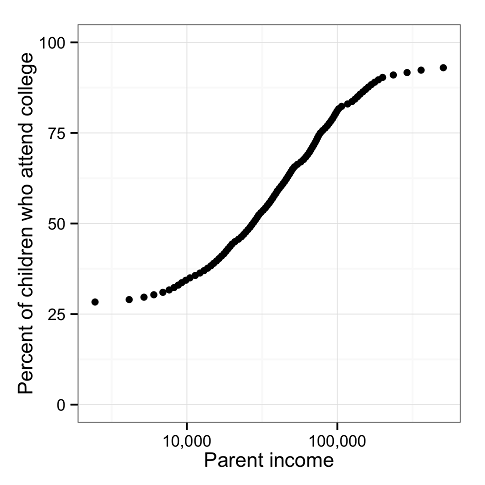
Probability of going to college vs income:
SPOILER ALERT – BELOW YOU WILL SEE THE ANSWER FROM THE NY TIMES
Probability of going to college vs income percentile:
R CODE FOR YOUR CODING PLEASURE


hi, does this data come from cps or nls or some other smaller survey? or from the collection from data table #9 on http://www.equality-of-opportunity.org/images/online_data_tables.xls nlsy is probably the best data source for the graphics that you are making. http://www.asdfree.com/search/label/national%20longitudinal%20surveys%20%28nls%29
May 30, 2015 @ 1:40 am
While it is a nice example of creating interactive graphics (on the part of the Upshot), it seems that no one wants to discuss the major confounding issue: children of parents who have completed a post-secondary degree are more likely to earn a post-secondary degree. Since a post secondary degree is highly correlated with wages/earning increases over the lifespan these would also be the individuals that would have higher income in the survey. If the relationship being graphed were representative of the true data generating process we could make a huge impact by giving every family $10k; it’d be nice for researchers to start acknowledging that the effect of poverty is not a direct effect on these outcomes but that it is mediated by the differential access to specific resources that directly affect the outcome.
May 30, 2015 @ 8:20 am