Once again, chart critics and graph gurus welcome
 Subscribe to Decision Science News by Email (one email per week, easy unsubscribe)
HOW TO DISPLAY A LINE PLOT WITH COUNT INFORMATION?
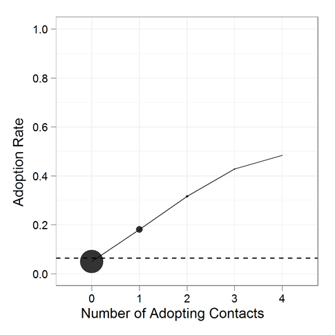
In a previously-mentioned paper Sharad and your DSN editor are writing up, there is the above line plot with points. The area of each point shows the count of observations. It’s done in R with ggplot2 (hooray for Hadley). We generally like this type of plot, however, we are concerned about whether it gives people a good sense of the relative counts or not.
Ask yourself this:
1) If the area of the big circle represents 1,000 observations, how many observations does the second-biggest circle represent?
2) If the area of the second-biggest circle represents as many observations as you just said, how many observations does the third-biggest circle represent?
Write down your answers. There’s a form to enter them in below.
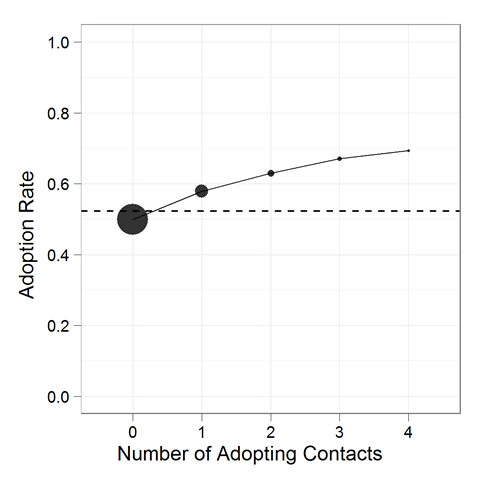
Now have a look at this one:
Same two questions:
3) If the area of the big circle represents 1,000 observations, how many observations does the second-biggest circle represent?
4) If the area of the second-biggest circle represents as many observations as you just said, how many observations does the third-biggest circle represent?
Kindly Record your answers here or use the embedded form below (if it is visible for you).
Watch this space for the exciting answer! If anyone has good ideas on presenting count information in a chart that relates an ordinal X and a continuous Y, please let us know.


Aren’t area plots like this dangerous? It’s hard for people to approximate relative area, especially for circles…
December 11, 2010 @ 7:56 pm
Sweet Daddy Purns!
I’ve heard warning about such plots as well: you don’t know if the reader is attending to the diameter, area, or volume. Hopefully, our quiz will give some insight into how tough it is for people to eyeball areas.
December 11, 2010 @ 10:21 pm
Tou may as well consider having different symbols, each one representing different numbers…Then you can just use a legend, referring to which number (or maybe range of number, e.g. 500–550) each symbol refers to…That’s what came on the top of my head…
A.
December 12, 2010 @ 3:54 am
What is the purpose of plotting the number of observations? Also, why do you need to overlay the number of observations on the same plot as adoption rate vs. contacts? It seems to me that you are trying to convey two separate messages on a single graph, which is usually a bad idea.
It seems likely that the number of observations is either of interest in it’s own right, in which case it should be plotted separately, or it is used to indicate the confidence in the resulting mean adoption rate. If the latter, then a better approach is to plot the mean point with error bars giving the 95% confidence interval on the mean. Large numbers of observations will result in narrower confidence intervals. This would also eliminate potential confusions caused by having a point that extends, like a continuous variable, along the x-axis.
December 12, 2010 @ 7:13 am
Why not use the number of counts a the x axis and just use the original, ordinal x as a label on the points they represent?
December 12, 2010 @ 1:30 pm
I agree with Tom’s comments in that a confidence interval would give the reader a better understanding IF they understood confidence intervals. Excellent dialogue
December 13, 2010 @ 7:21 am
[…] If you are the type of reader who remembers things from last week, you may remember the great area plot quiz we had running. […]
December 19, 2010 @ 12:58 am