Some ideas on communicating risks to the general public
 Subscribe to Decision Science News by Email (one email per week, easy unsubscribe)
SOME EMPIRICAL BASES FOR CHOOSING CERTAIN RISK REPRESENTATIONS OVER OTHERS
An example of an information grid
This week DSN posts some thoughts (largely inspired by the work of former colleagues Stephanie Kurzenhäuser, Ralph Hertwig, Ulrich Hoffrage, and Gerd Gigerenzer) about communicating risks to the general public, providing references and delicious downloads where possible.
Representations to use less often
Single-event probabilities as decimals or percentages
Statements of the form “The probability that X will happen is Y”, such as “The probability that it will rain on January 1st is 30%” are single-event probability statements. They are problematic not only for philosophical reasons (some “frequentists” (as opposed to “Bayesians”) say that such statements are meaningless), but also because they are ambiguous: they do not specify if we’re saying this about January First based on other January Firsts, or if we’re saying it based on all January Firsts at a particular weather station (or an average across many weather stations), or if we’re not even considering the date but basing our prediction on today’s weather, a mathematical model, an average of other people’s forecasts, our intuition, or what.
What may seem unambiguous is actually interpreted by different people in different ways. A survey of people in 5 international cities found no agreement on what a 30% chance of rain means. Some thought it means rain on 30% of the the day’s minutes, others thought rain in 30% of the land area, and so on [1]. A further problem with the statement is that it gives no information about what it means to rain. Does one drop of rain count as rain? Does a heavy mist? Does one minute of rain count?
In addition, when risks are described as probabilities, people tend to overweight small probabilities and underweight large probabilities. This observation shows up in the “probability weighting function” of Tversky & Kahneman’s Prospect Theory, the dominant behavioral model of gamble evaluations. A representation that leads to misperceptions of underlying probabilities is undesirable.
Conditional probabilities as decimals or percentages
Doctors given problems of the type:
The probability of colorectal cancer in a certain population is 0.3% [base rate]. If a person has colorectal cancer, the probability that the haemoccult test is positive is 50% [sensitivity]. If a person does not have colorectal cancer, the probability that he still tests positive is 3% [false-positive rate]. What is the probability that a person from the population who tests positive actually has colorectal cancer?
give mostly incorrect answers that span the range of possible probabilities. Typical answers include 50% (the “sensitivity”) or 47% (the sensitivity minus the “false positive rate”). The correct answer is 5%. [2]
It seems as if people given conditional probabilities, such as the sensitivity or the false-positive rate, confuse them with the posterior probability they are being asked for. This likely happens because each numerical representation lends itself to computations that are easy or difficult for that representation. The thing to do with the conditional probabilities listed above is to plug them into Bayes Theorem, which most people do not know. Even if they know the theorem, they have little intuition for it and cannot make good mental estimates.
Fortunately, there are other ways to represent information than conditional probabilities that allow even those who do not know Bayes’ theorem to arrive at the correct answer, as we shall see.
Relative risks
Relative risk statements speak of risk increasing or decreasing by a percentage, for instance, that mammography in women over 40 reduces the risk of breast cancer by 25%. But all percentages erase the frequencies from which they were derived. We cannot tell from the relative risk reduction what is the absolute risk reduction: by how much does the risk of breast cancer actually decrease between those who get mammographies and those who do not: the answer is .1%
Relative risk information does not give information on how many people need to undergo a treatment before a certain benefit is obtained. In particular, based on the relative risk information, can one say how many women must be screened before a single life is saved? If your intuition tells you 4, you are again far off, as 1000 women must be screened to save the one life. In this way, relative risk information can cause people to misjudge the effectiveness of treatments [3].
Representations to use more often
Natural frequencies instead of probabilities
Consider the colorectal cancer example given previously. Only 1 in 24 doctors tested could give the correct answer. The following, mathematically-equivalent, representation of the problem was given to doctors (also from [3]):
Out of every 10,000 people, 30 have colorectal cancer. Of these 30, 15 will have a positive haemoccult test. Out of the remaining 9,970 people without colorectal cancer, 300 will still test positive. How many of those who test positive actually have colorectal cancer?
Without any training whatsoever, 16 out 24 physicians obtained the correct answer to this version. That is quite a jump from 1 in 24.
Statements like 15 out of 30 are “natural frequency” statements. They correspond to the, trial-by-trial way we experience information in the world. (For example, we’re more likely to encode that 3 of our last 4 trips to JFK airport were met with heavy rush-hour traffic than encoding p = .75, which removes any trace of the sample size). Natural frequency statements lend themselves to simpler computations than does Bayes’ Theorem, and verbal protocols show that given statements like the above, many people correctly infer that the probability of cancer would be the number testing positive and who have the disease (15) divided by the number who get back positive test results (15 who actually have it + 300 false alarms). 15 divided by 315 is 5%, the correct answer. Bet you didn’t know you were doing a Bayesian computation.
Frequencies relative to a reference class
While compact statements of probability such as a “there is a 30% chance of rain on April first” save words, they do not reveal their underlying reference classes. When information is conveyed with statements like “In New York City, 3 out of every 10 April Firsts have more than a centimeter of rain” there is no ambiguity as to whether the 30% refers to days, area, or time, and it is more clear what “rain” means. It also conveys how you arrived at the forecast (an analysis of historic data, not a prediction based on a model).
Information grids
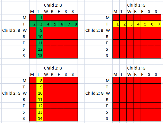
The Information Grid from the surprisingly popular Decision Science News post Tuesdays’ Child is Full of Probability Puzzles
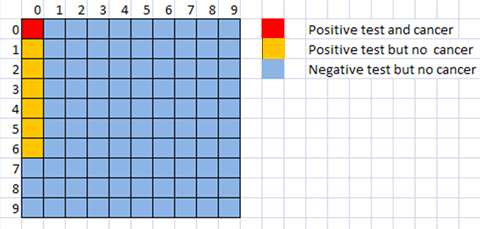
Since probabilities can be translated to frequencies out of 100, 1000, 10000 and so on, they can easily be represented visually on grids that allow for visual assessment of area and facilitate counting. Research by my former office-mate Peter Sedlmeier [4] used information grids to teach people how to solve Bayesian reasoning problems (like the original colorectal cancer problem) by converting them into natural frequencies and representing them on a grid. Even six months later, experimental participants who received the information grid instruction were able to solve the problems correctly, while those who were instructed with the classic version of Bayes Theorem did not retain what they learned.
Information grids whose squares are embellished with faces showing positive or negative emotions have also proven effective in presenting treatment alternatives to patients [5].
Absolute risk reductions as frequencies
The statement that a certain treatment causes a 25% risk reduction, as mentioned, does not disclose the magnitudes of the risks involved. In the case studied, among women receiving mammographies 3 in 1000 died of cancer, while among women not receiving mammographies 4 in 1000 died of this cause. The absolute risk reduction pops out of this formulation, and we see it to be 1 in 1000. The number needed to treat, which is not computable from the relative risk reduction is now clear: to save one life, 1000 women must be screened. This formulation not only expresses the difference between alternative actions, but relates absolute magnitudes of risk as well.
The (probability) Distribution Builder of Goldstein, Johnson and Sharpe (2008)
Animations
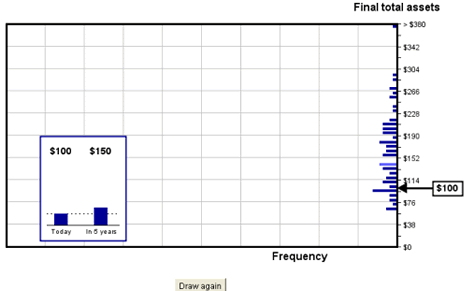
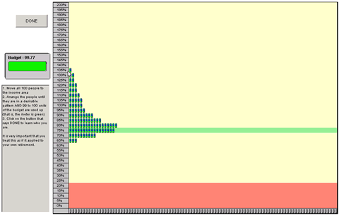
While descriptive numerical probability formats leads to overweighting of small probabilities, recent research shows that when people learn probabilities through experience (actually taking draws from a distribution) it may lead to the opposite tendency: underweighting of large probabilities. An exciting possibility is that when descriptive and experienced probability formats are combined, the effects may cancel each other out. Other research shows that making draws from animated probability distributions led people to arrive at the most accurate estimates of the probability of a loss and of upside return of an investment [6]. Decision aids such as the Distribution Builder of Goldstein, Johnson, & Sharpe [7] allow participants to visually observe the magnitude of probabilities (as information grids do), while animating numerous draws from the distribution to allow people to experience random sampling. We propose to experiment with this format to see if it may lead to calibrated probability weighting.

The simulator of Haisley, Kaufmann and Weber
[1]
Gigerenzer, G. , Hertwig, R., van den Broek, E., Fasolo, B., & Katsikopoulos, K. V. (2005). “A 30% chance of rain tomorrow”: How does the public understand probabilistic weather forecast? Risk Analysis, 25, 623-629. Available online.
[2]
Hoffrage, Ulrich & Gigerenzer G. (1998). Using natural frequencies to improve diagnostic inferences. Academic Medicine, 73, 538-540. Available online.
[3]
Kurzenhauser, Steffi & Ralph Hertwig (2006). Kurzenhäuser, S., & Hertwig, R. (2006). How to foster citizens’ statistical reasoning: Implications for genetic counseling. Community Genetics, 9, 197-203. Available online.
[4]
Sedlmeier, Peter and Gerd Gigerenzer (2001) Teaching Bayesian reasoning in less than two hours. Journal of Experimental Psychology General, 130, 380–400. Available online.
[5]
Man-Son-Hing, Malcolm et al (1999) Therapy for Stroke Prevention in Atrial Fibrillation: A Randomized Controlled Trial. Journal of the American Medical Association, 282(8):737-743. Available online.
[6]
Haisley, Emily, Christine Kaufmann and Martin Weber (working paper) The Role of Experience Sampling and Graphical Displays on One’s Investment Risk Appetite. Available online.
[7]
Goldstein, Daniel G., Johnson, Eric J. & Sharpe, William F. (2008). Choosing Outcomes Versus Choosing Products: Consumer-Focused Retirement Investment Advice. Journal of Consumer Research, 35 (October), 440-456. Available online.


[…] I found an interesting article on how to communicate risks and probabilities to the public. […]
December 4, 2010 @ 7:29 pm
[…] Moderator Join Date: Sep 2005 Location: Canuckistan Posts: 3,882 SOME IDEAS ON COMMUNICATING RISK TO THE GENERAL PUBLIC | Decision Science News […]
December 5, 2010 @ 4:43 am
Regarding the cancer Bayes theorem example, is it in fact 5% (15/300) or ~4.7% (15/315)? Plugging in to Bayes theorem, per wikipedia, P(B|A)P(A)/P(B) suggests exactly 5% (15/300) but 15/315 makes more sense to me intuitively.
December 5, 2010 @ 10:27 am
The exact answer is 15/315 or 4.7%
Bayes Formula gives P(Cancer)*P(Positive Test|Cancer) as the numerator, but the denominator is
P(Cancer)*P(Positive Test| Cancer) + P(No Cancer)*P(Positive Test| No Cancer)
or = (0.003*0.5)/( (0.003*0.5) + (0.997*0.03) ) = 4.7%
December 5, 2010 @ 3:46 pm
[…] a black turtleneck and using an iPad. So if you want something interesting to read, check out Some Ideas on Communicating Risk to the General Public. As a self professed statistics nerd, it turns out I’m really bad at communicating […]
December 6, 2010 @ 7:13 pm
I wonder whether there are any papers on real life situaitons (i.e. not gambles in the lab) that show that people tend to overweight small probabilities and underweight large probabilities as suggested by PT?
December 7, 2010 @ 3:21 pm
GOOD writing. The prospect of reading more of Decision Science News now intrigues me.
December 7, 2010 @ 10:30 pm
What’s really sad is that, even after being given whole numbers to work with, only 16 out of 24 physicians got the right answer.
December 8, 2010 @ 1:55 am
Tried a few times to take the next step – allow people to experience Bayesian Inference by taking an observed result then drawing the unknown from a prior, then drawing fake data given that parameter and then just keeping those parameters drawn where the fake data equalled the observed result (hence a sample from the posterior).
In a group, all of whom had graduate degrees (~ 1/3 Phds) they were very, very confused. Perhaps being given a batch of numbers (a sample from the posterior) as an answer to a quantitative question just seemed too strange to be sensible.
But wondering if there is anyone doing research on grasping the posterior distribution (or a good sample from it) as an answer (inference) for those with little training in statistics?
K?
December 8, 2010 @ 3:02 pm
This was a good read, kudos for the writing. Like some of the other posters here, I am concerned by the fact that the physicians did so poorly on this test. Yet another reason why I think Arthur Benjamin was right in his “formula for changing math education” TED talk.
December 8, 2010 @ 7:03 pm
[…] SOME IDEAS ON COMMUNICATING RISK TO THE GENERAL PUBLIC | Decision Science News This week DSN posts some thoughts (largely inspired by the work of former colleagues Stephanie Kurzenhäuser, Ralph Hertwig, Ulrich Hoffrage, and Gerd Gigerenzer) about communicating risks to the general public, providing references and delicious downloads where possible. (tags: risk resources) […]
December 9, 2010 @ 12:02 am
Incredibly interesting article, especially considering the implications of how information is presented to people who have neither the time nor ability to thoroughly analyze the flood of data one is faced with over the course of the day. The burden of responsibility is on the experts to digest and present data properly. To often do people just accept numbers (and make important decisions on them) that don’t tell the full story.
Tom C
Baltimore Investment Management
December 30, 2010 @ 12:18 am
[…] the full article and tell us your opinion about it. No TweetBacks yet. (Be the first to Tweet this […]
February 12, 2011 @ 1:10 pm
[…] written before about avoiding relative risk formats in communicating risks to the general […]
December 6, 2011 @ 3:38 pm
[…] written before about the challenges of communicating risks. Can people understand the risks inherent in their savings plans, loans, surgeries, or medications? […]
February 4, 2012 @ 2:00 pm
[…] written before about using information grids when communicating risks to the general public. We like them. Turns out they are also called pictographs and, as we learned from an email from […]
October 30, 2012 @ 10:03 pm