The housing bubble: Where are we?
DIFFERENT CITIES TELL DIFFERENT STORIES
Last spring we looked at the state of the housing bubble in the US. The question on readers’ minds then was “where is it going next”? Since Decision Science News is looking for a place to buy, it is on our minds as well.
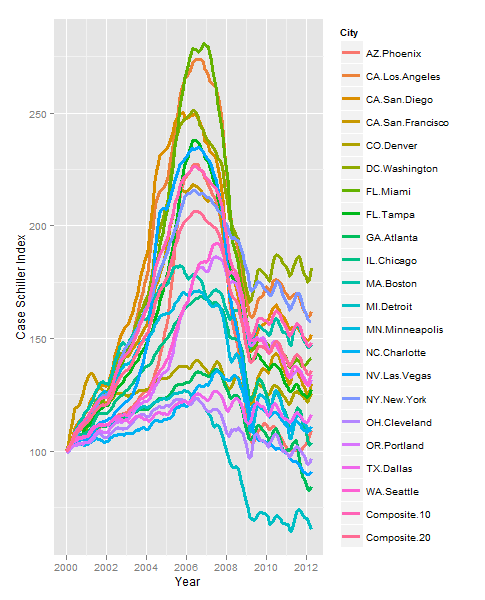
It’s been more than a year, so let’s have a look. Above, we see the plot for all cities. We realize the colors are hard to follow, so if you want to track your city, download the spreadsheet.
In January 2011, the average index value across the cities represented here was 127, in April 2012 (the latest data we have) it was 124. The “composite 10” score in January 2011 was 154, it went to 148. Similarity the “composite 20” value went from 141 to 136. So, things have continued to drop a bit.
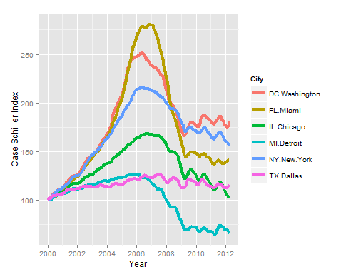
All depends on the local market, however. This is an Olympic year, so we really should highlight a few exceptional stories (the same ones we profiled in 2011):
Want to reproduce these graphs yourself? Go right ahead! Here’s the code. Plots are made with R and Hadley Wickham‘s ggplot2.
library(ggplot2)

library(reshape)

## Read in data, available from:

#www.standardandpoors.com/indices/sp-case-shiller-home-price-indices/en/us/?indexId=spusa-cashpidff--p-us----

#Delete the 2nd row and make 1st col 1st row say YEAR

dat=read.csv("CSHomePrice_History.csv")

mdf=melt(dat,id.vars="YEAR")

mdf$Date=as.Date(paste("01-",mdf$YEAR,sep=""),"%d-%b-%y")

names(mdf)=c("MonthYear","City","IndexValue","Date")

mdf$yr=format(mdf$Date,"%Y")

mdf=subset(mdf,yr>1999)

ggplot(data=mdf,aes(x=Date,y=IndexValue)) + geom_line(aes(color=City),size=1.25) +

scale_x_date("Year", minor_breaks="years") + scale_y_continuous("Case Schiller Index")

sm=subset(mdf,City %in% c('NY.New.York','FL.Miami','CA.Los Angeles','MI.Detroit',

'TX.Dallas','IL.Chicago','DC.Washington'))

sm$City=droplevels(sm$City)

ggplot(data=sm,aes(x=Date,y=IndexValue)) + geom_line(aes(color=City),size=1.5) +

scale_x_date("Year", minor_breaks="years") + scale_y_continuous("Case Schiller Index")


The simplest way to answer the question: plot (median house / median income) for your location, SMSA is nice but might not be available, and extrapolate until the long term trend crosses. Since median income has been essentially static since Reagan, save for Clinton, 1980 nominal price is the goal.
July 25, 2012 @ 5:03 pm
Ah, sorry, didn’t notice the Brit references, although Maggie and Ronny were contemporary.
July 25, 2012 @ 5:04 pm
The charts very much remind of a similar picture in the UK and Ireland:
http://lamages.blogspot.com/2012/06/uk-house-prices-visualised-with.html
July 26, 2012 @ 2:47 pm
Very nice, Markus! I also like how the mouseover shows which line is which in googleVis. My 1st chart would really benefit from that.
July 26, 2012 @ 3:10 pm