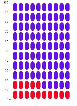
| Figure 1: An icon array representing a 15% probability of some negative outcome. This is also an example of the random icon arrays used in Experiment 2. |
Judgment and Decision Making, Vol. 17, No. 2, March 2022, pp. 378-399
Effects of icon arrays to communicate risk in a repeated risky decision-making taskPaul C. Price* Grace A. Carlock# Sarah Crouse$ Mariana Vargas ArcigaX |
Abstract:In two experiments, participants decided on each of several trials whether or not to take a risk. If they chose to take the risk, they had a relatively high probability (from 75% to 95%) of winning a small number of points and a relatively low probability (5% to 25%) of losing a large number of points. The loss amounts varied so that the expected value of taking the risk was positive on some trials, zero on others, and negative on the rest. The main independent variable was whether the probability of losing was communicated using numerical percentages or icon arrays. Both experiments included random icon arrays, in which the icons representing losses were randomly distributed throughout the array. Experiment 2 also included grouped icon arrays, in which the icons representing losses were grouped at the bottom of the array. Neither type of icon array led to better performance in the task. However, the random icon arrays led to less risk taking than the numerical percentages or the grouped icon arrays, especially at the higher loss probabilities. In a third experiment, participants made direct judgments of the percentages and probabilities represented by the icon arrays from Experiment 2. The results supported the idea that random arrays lead to less risk taking because they are perceived to represent greater loss probabilities. These results have several implications for the study of icon arrays and their use in risk communication.
Keywords: icon arrays, risk perception, risk communication
Icon arrays are one of many graphical methods for communicating risk probabilities (Garcia-Retamero & Cokely, 2013). Figure 1, for example, is an icon array meant to communicate that some negative outcome has a 15% probability of occurring. The 100 ovals represent 100 cases, with the 15 red ovals representing the number of cases out of 100 for which the negative outcome is expected to occur. The icon array in Figure 1, therefore, could be used to communicate a 15% chance that a person will have a heart attack, a 15% chance that a business venture will fail, or a 15% chance that a picnic will be spoiled by rain.
Figure 1: An icon array representing a 15% probability of some negative outcome. This is also an example of the random icon arrays used in Experiment 2.
Icon arrays have been recommended as an effective way to communicate risk — especially for people who are low in numeracy (e.g., Fagerlin et al., 2011; Garcia-Retamero & Cokely, 2013). These recommendations are based on both theoretical and empirical considerations. Theoretically, it has been argued that icon arrays are beneficial because they communicate in terms of relative frequencies rather than single-event probabilities (Tubau et al., 2019), they explicitly present information about how often the negative outcome is expected to occur and not to occur (Garcia-Retamero et al., 2010), they are more easily and automatically processed (Ancker et al., 2006; Trevena et al., 2013), and they result in deeper and more meaningful gist represenetations as opposed to surface-level verbatim representations (Brust-Renck et al., 2013). Empirically, icon arrays have been shown to help people solve Bayesian inference problems (Böcherer-Linder & Eichler, 2019; Brase, 2014; Tubau et al., 2019), improve their comprehension of relative and absolute risk-reduction statistics (Galesic et al., 2009; Garcia-Retamero et al., 2010), reduce their susceptibility to gain-loss framing effects (Garcia-Retamero & Galesic, 2010), and change their beliefs, emotions, and behavioral intentions in potentially adaptive ways (e.g., Nguyen et al., 2019; Walker et al., 2020). It is important to note, however, that not all studies have shown advantages of icon arrays over numerical representations (Etnel et al., 2020; Ruiz et al., 2013; Wright et al., 2009).
Despite all the research on icon arrays, however, there is surprisingly little on whether they actually help people make better decisions. As a starting point, we decided to test for an effect of icon arrays in a laboratory-based task that is similar to those used in many studies of risky decision making (e.g., Schneider et al., 2016; Shapiro et al., 2020; Tymula et al., 2012). On each trial, college student participants decided whether or not to take a risk that had a relatively high probability of winning a small number of points and a relatively low probability of losing a large number of points. The expected value of taking the risk was positive on some trials, zero on others, and negative on the rest. Crucially, the loss probability was communicated using either numerical probabilities or icon arrays. This approach has the advantage of allowing us to focus on the quality of participants’ decisions in terms of a) the total number of points they earn in the task and b) the extent to which they use the optimal strategy of taking the risk when the expected value of doing so is positive and not taking the risk when the expected value of doing so is negative. There are at least two reasons that icon arrays might be helpful in this task. One is that they might attract greater attention to the loss probability and thereby mitigate any tendency people have toward underweighting it relative to the loss amount. This might help them recognize when, for example, a relatively small (or large) loss amount is offset by relatively large (or small) loss probability. The other is that icon arrays might help people form more accurate, precise, or reliable cognitive representations of the loss probability. This, in turn, might help them distinguish more clearly and consistently between trials with positive and negative expected values.
A secondary question concerned the effect of alternative icon array formats (e.g., Zikmund-Fisher et al., 2014). In the present studies, we focused specifically on the effect of using random icon arrays, in which the icons representing the negative outcome are distributed throughout the array, versus the more typical grouped icon arrays (also called sequential or consecutive icon arrays), in which the icons representing the negative outcome are grouped together. This is important for at least two reasons. First, some research suggests that random icon arrays are more difficult for people to understand than grouped icon arrays (Ancker et al., 2009; Schapira et al., 2001). Thus grouped icon arrays may lead to improved decision making even when random icon arrays do not. Second, Ancker et al. (2011) found that random icon arrays were judged to contain a greater percentage of icons representing the negative outcome than were equivalent grouped icon arrays. This could mean that random icon arrays cause people to perceive greater risk and therefore engage in less risk taking.
The participants were 88 introductory psychology students (64 female and 24 male) at California State University, Fresno. They participated as part of a course requirement. The sample size was determined by the number of student participants allotted to the researchers during that academic term. A sensitivity power analysis using G*Power (Faul et al., 2007) shows that this sample size provided power of 80% to detect a moderate difference in points earned of d = 0.60. Assuming a correlation of .50 between repeated measures, we would also have 80% power to detect a fairly small group (numerical percentage vs. icon array) × expected value interaction of ηp2 = .018. This particular interaction is important because it would indicate a difference between groups in sensitivity to the expected value of taking a risk.
The participants played a computerized game in which they made a series of decisions about whether or not to try to “defuse a bomb” by clicking on an image of a bomb or to pass by clicking on the word “pass.” If they tried to defuse the bomb, one of two things happened. Either they succeeded and won 10 points or the bomb exploded and they lost some larger number of points. To help them make each decision, they were provided with information about the probability that the bomb would explode and the number of points they would lose if it did. The probability that the bomb would explode varied from trial to trial. It was either 5, 10, 15, 20, or 25%. The number of points participants lost if the bomb exploded also varied from trial to trial in such a way that the expected value of trying to defuse the bomb was either +5 points, 0 points, or −5 points. The exact loss amounts are shown in Table 1. Thus there were 15 distinct combinations of loss probability and loss amount. The entire game consisted of five blocks, each of which included these 15 distinct combinations in a random order, for a total of 75 trials.
Table 1: Loss amounts for each of the 15 different combinations of loss probability and expected value (EV) in Experiments 1 and 2. The gain amount was always +10.
Loss Probability
Participants were randomly assigned to one of two conditions. In the numerical probability condition, the loss probabilities were always communicated in the form of a numerical percentage. In the icon array condition, the loss probabilities were always communicated in the form of a random icon array (Figure 2). The icon arrays consisted of 100 squares arranged in a 10 × 10 grid. The squares that represented cases for which the bomb exploded were red and were distributed quasi-randomly throughout the array. The remaining squares were blue. Note that because icon arrays necessarily present both the number of cases for which the negative outcome occurs and does not occur, the numerical probability condition included both the probability that the bomb would explode (in red text) and the probability that it would not explode (in blue text). In both conditions, this information was presented prominently in the middle of the computer screen.
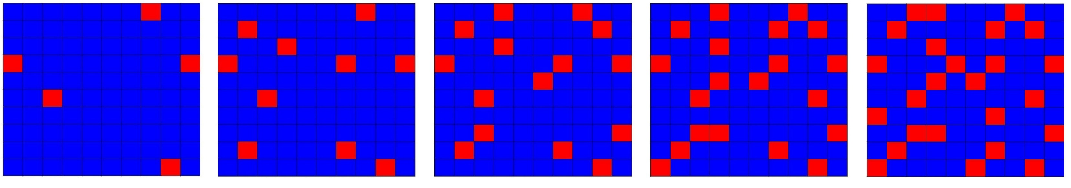
Figure 2: The icon arrays used in Experiment 1.
Participants were tested at a desktop computer. The game was explained to them by a researcher as they looked at a static screen displaying a sample trial. The instructions emphasized that their goal was to earn as many points as they could and that the probabilities and loss amounts made it so that trying to defuse the bomb was sometimes the best decision and passing was sometimes the best decision. Participants then completed the 75 trials at their own pace and then immediately completed a computerized version of the eight-item Subjective Numeracy Scale (Fagerlin et al., 2007).
Because we were interested in the effect of icon arrays on participants’ overall performance in the task, we looked first at the total number of points that participants earned across the 75 trials. As the boxplots in Figure 3 show, the distributions in the two conditions were quite similar. The icon array condition had a slightly higher median (1.00 vs. −19.00) but this difference was not statistically significant by a median test (χ2[1] = 0.18, p = .670). The numerical probability condition had a slightly higher mean (7.20, SD = 143.62 vs. −11.45, SD = 153.06) but again this difference was not statistically significant (t[86] = 0.59, p = .56, d = 0.13). Because the total number of points earned was so variable, we also computed participants’ expected number of points based on the number of times they tried to defuse the bomb in the positive and negative expected value conditions. Here the numerical probability condition had the slightly lower mean (21.48, SD = 24.60 vs. 23.18, SD = 27.83) but this difference was not statistically significant (t[86] = 0.30, p = .762, d = .06).
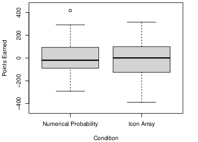
Figure 3: Boxplots showing the distribution of points earned in the numerical probability and icon-array conditions in Experiment 1.
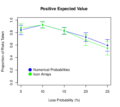
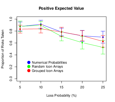
We looked next at the tendency to take the risk (i.e., attempt defuse the bomb). For each participant, we computed the proportion of risks taken for each of the 15 trial types. The means and confidence intervals are presented in Figure 4. (All confidence intervals were computed using the procedure for repeated-measures designs described by Morey, 2008.) We also conducted a repeated-measures ANOVA with probability and expected value as within-subjects factors and condition as a between-subjects factor. We found that the proportion of risks taken decreased as the loss probability increased (F[4,344] = 48.98, p < .001, ηp2 = .363), and it also decreased as the expected value of the risky choice decreased (F[2,172] = 51.11, p < .001, ηp2 = .373). This shows that participants were sensitive to variation in both of these task parameters, albeit in a way that was far from optimal. (Again, optimal would mean always taking the risk when the expected value was positive and never taking the risk when the expected value was negative.) The probability × expected value interaction was also significant (F[8,688] = 2.77, p = .005, ηp2 = .031). This is because for positive expected values only, there was a distinct increase in risk taking between loss probabilities of 5 and 10%. There was no main effect of condition (F[1,86] = 0.79, p = .377, ηp2 = .009) and no condition × probability interaction (F[4,344] = 2.27, p = .062, ηp2 = .026). (It is worth pointing out, however, that participants in the icon-array condition tended to take fewer risks when the loss probability was relatively high and that this interaction was statistically significant in Experiment 2.) There was no condition × expected value interaction (F[2,172] = 0.36, p = .699, ηp2 = .004), which suggests that icon arrays did not help participants distinguish the different expected values. There was no three-way interaction (F[8,688] = 1.61, p = .118, ηp2 = .018).
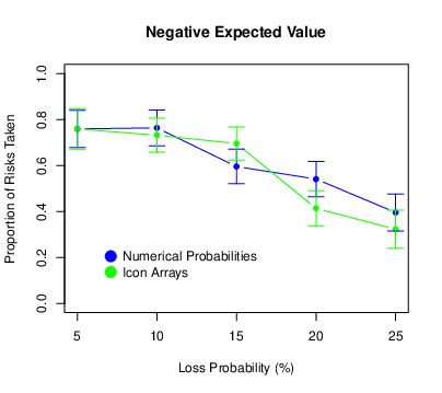
Figure 4: Means of the proportion of risks taken in Experiment 1, with error bars representing 95% confidence intervals.
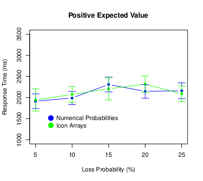
We also recorded the amount of time it took participants to make each decision. Because they were free to take as much time as they wanted, they occasionally took much longer than usual — perhaps because they were trying to understand the task, reassessing their strategy, or simply resting. For this reason, we excluded all response times that exceeded 10 s. This cutoff is somewhat arbitrary but resulted in the exclusion of all obviously anomalous response times yet only 2.8% of the total number. Then, for each participant we computed the mean response time for each combination of probability and expected value. These results are shown in Figure 5.
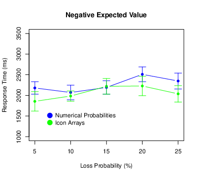
Figure 5: Means of the response times in Experiment 1, with error bars representing 95% confidence intervals.
There was a main effect of probability (F[4,340] = 12.28, p < .001, ηp2 = .126), with participants generally taking longer to respond for higher loss probabilities. There was no main effect of expected value (F[2,170] = 0.88, p = .418, ηp2 = .010) and no probability × expected value interaction (F[8,680] = 1.03, p = .409, ηp2 = .012). There was no main effect of condition (F[1,85] = 0.15, p = .697, ηp2 = .002) and no probability × condition interaction (F[4,340] = 1.66, p = .158, ηp2 = .019). There was, however, an expected value × condition interaction (F[2,170] = 3.10, p = .048, ηp2 = .035). For negative expected values only, participants in the numerical probability condition tended to respond more slowly. There was no three-way interaction (F[8,680] = 1.53, p = .144, ηp2 < .018).
Because icon arrays sometimes have a greater impact on people with low numeracy (e.g., Galesic et al., 2009), we also wanted to explore the role of numeracy as measured by the Subjective Numeracy Scale (SNS). We started by computing each participant’s SNS score by taking the mean rating across the eight items. The mean of these scores across all participants was 3.88 with a standard deviation of 0.82. These values are similar to — if not slightly lower than — those reported by other researchers using large representative samples. For example, Zikmund-Fisher et al. (2007; Study 3) reported a median score of 4.50 with an interquartile range of 3.75 to 5.13 for a sample of 1234 adults that was designed to mirror the U.S. population. By comparison, our median was 3.88 with an interquartile range of 3.28 to 4.50. In other words, even though our participants were all young adult college students, their SNS scores were not especially high nor restricted in range.
Even so, subjective numeracy played little role in participants’ overall performance. It was only weakly (and negatively) correlated with the number of points they earned (r[86] = −.14, p = .20) and the overall proportion of risks they took (r[86] = −.04, p = .68). We also included subjective numeracy as a covariate in separate ANOVAs looking at points earned, proportion of risks taken, and response time. For points earned and for the proportion of risks taken there were no significant main effects or interactions involving subjective numeracy. For response time, there was an expected value × condition × subjective numeracy interaction (F[2,166] = 5.63, p = .004, ηp2 = .064) that was not replicated in Experiment 2. We also conducted the ANOVAs reported throughout this research with subjective numeracy as a categorical variable (low vs. high) based on a median split. These results, which are summarized at http://osf.io/wtndc, are generally consistent with those reported here and do not change any of our basic conclusions.
In Experiment 1, icon arrays had minimal effects on participants’ performance in our risky decision-making task. They did not affect the number of points earned, the overall proportion of risks taken, or sensitivity to the expected value of taking the risk. There was, however, a trend toward participants in the icon-array condition taking fewer risks at the higher loss probabilities. It also appeared that icon arrays had similar effects regardless of participants’ level of numeracy.
A potentially important feature of Experiment 1 is that we used random icon arrays rather than the more typical grouped icon arrays. Recall that people often find random icon arrays more difficult to understand than grouped icon arrays (Ancker et al., 2009; Shapira et al., 2001), which might explain why they were not helpful here. Furthermore, people have been shown to judge icon arrays to represent greater percentages than they actually do, and this tendency is more pronounced for random icon arrays than for grouped icon arrays (Ancker et al., 2011). This could be why the random icon arrays in Experiment 1 led to less risk taking than the numerical percentages. For these reasons, we conducted Experiment 2 with a numerical probability condition, a random icon-array condition, and a grouped icon-array condition.
The participants were 113 introductory psychology students (82 women and 31 men) at California State University, Fresno. They participated as part of a course requirement, and none of them had participated in Experiment 1. The sample size was determined by the number of student participants allotted to the researchers during that academic term. A sensitivity power analysis using G*Power shows that this sample size provided power of 80% to detect a moderate between-groups effect of ηp2 = .035 and, assuming a correlation of .50 between repeated measures, a fairly small group × expected value interaction of ηp2 = .018.
The design and procedure were essentially the same as in Experiment 1 but now there were three conditions: a numerical-percentage condition and two icon-array conditions. The numerical-percentage condition was the same as in Experiment 1. For the grouped icon-array condition, we used the website http://iconarray.com to create icon arrays that differed in a few ways from those in Experiment 1. (See Figure 1 for an example.) First, the icons were ovals organized into a 10 x 10 grid that was taller and narrower than in Experiment 1. Second, the numbers 0, 10, 20, … 100 appeared along the left hand side of the icon array to indicate the cumulative number of icons starting at the bottom. Presumably, this makes it easier to know the precise number and percentage of icons representing the negative outcome. For the random icon-array condition, we modified these grouped icon arrays by distributing the red icons quasi-randomly throughout the array. For each probability, we then created a second random icon array by turning the first one upside down.
In all three conditions, participants again completed 5 blocks of 15 trials each, where the 15 trials within a block included all 15 combinations of loss probability (5, 10, 15, 20, and 25%) and expected value of taking the risk (+5, 0, and −5). Recall that in the random icon array condition there were two versions of each icon array, so one of the two was randomly selected on a trial-by-trial basis. Participants also completed the Subjective Numeracy Scale at the end of the procedure.
As the boxplots in Figure 6 show, the distributions of points earned in the three conditions were again quite similar. The medians were −61.00 in the numerical probability condition, 23.50 in the grouped icon-array condition, and 17.00 in the random icon-array condition. These differences were not statistically significant by a median test (χ2[2] = 0.88, p = .645). The means were −33.54 (SD = 161.86) in the numerical probability condition, −6.39 (SD = 168.66) in the grouped icon-array condition, and 15.39 (SD = 166.88) in the random icon-array condition, but again these differences were not statistically significant (F[2,110] = 0.82, p = .444, ηp2 = .015). Finally, the means of the expected number of points were 26.08 (SD = 24.58) in the numerical probability condition, 23.42 (SD = 25.20) in the grouped icon-arrays condition, and 31.31 (SD = 31.02) in the random icon-arrays condition. And again these differences were not statistically significant (F[2,110] = 0.83, p = .437, ηp2 = .015).
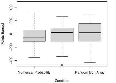
Figure 6: Boxplots showing the distribution of points earned in the numerical probability, grouped icon-array, and random icon-array conditions in Experiment 2.
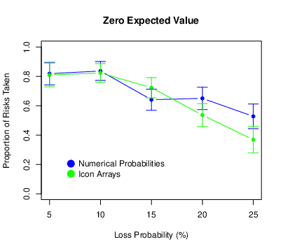
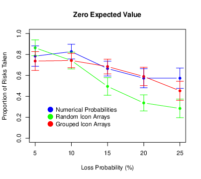
The means and standard errors of the proportion of risks taken are presented in Figure 7. We found again that risk taking decreased as the loss probability increased (F[4,440] = 56.05, p < .001, ηp2 = .338) and it also decreased as the expected value of the risky choice decreased (F[2,220] = 94.86, p < .001, ηp2 = .463). The probability × expected value interaction was again significant (F[8,880] = 5.72, p < .001, ηp2 = .049). The pattern was similar to that in Experiment 1 where, for positive expected values only, there was an increase in risk taking between loss probabilities of 5 and 10%. There was a significant main effect of condition (F[2,110] = 5.03, p = .008, ηp2 = .084), which was qualified by a significant probability × condition interaction (F[8,440] = 4.04, p < .001, ηp2 = .068). Participants in the random icon-array condition engaged in less risk taking than did participants in the numerical-percentage condition or the grouped icon-array condition, especially so at the higher loss probabilities. There was no condition × expected value interaction (F[4,220] = 1.14, p = .338, ηp2 = .020), but there was a significant three-way interaction (F[16,880] = 1.67, p = .047, ηp2 = .029). For participants in the random icon-array condition, the drop-off in risk taking was less pronounced for the positive expected values.
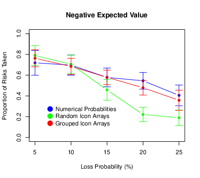
Figure 7: Means of the proportion of risks taken in Experiment 2, with error bars representing 95% confidence intervals.
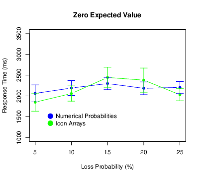
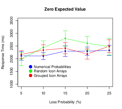
We used the same procedure to exclude extreme response times as we did for Experiment 1. This time it eliminated 2.7% of the responses. Figure 8 shows the results. There was again a main effect of probability (F[4,440] = 12.57, p < .001, ηp2 = .103), with participants taking longer to respond for higher loss probabilities. This time there was also a main effect of expected value (F[2,220] = 8.61, p < .001, ηp2 = .073), with participants responding most quickly for positive expected values. There was no probability × expected value interaction (F[8,880] = 0.37, p = .937, ηp2 = .003). There was no main effect of condition (F[2,110] = 0.82, p = .444, ηp2 = .015). There was, however, a probability × condition interaction (F[8,440] = 4.13, p < .001, ηp2 = .070), with participants in the random icon-array condition exhibiting a pronounced increase in response times at the middle probabilities. There was no expected value × condition interaction (F[4,220] = 0.48, p = .754, ηp2 = .009. 009) or three-way interaction (F[16,880] = 0.88, p = .598, ηp2 = .016).
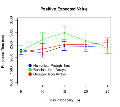
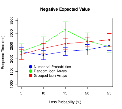
Figure 8: Means of the response times in Experiment 2, with error bars representing 95% confidence intervals.
The mean SNS score was 4.15 with a standard deviation of 0.85. Again, subjective numeracy was only weakly correlated with the number of points earned (r[111] = .14, p = .137), and the overall proportion of risks taken (r[111] = −.01, p = .953). When subjective numeracy was included as a covariate in the analyses, some statistically significant interactions emerged for the proportion of risks taken. There was an expected value × subjective numeracy interaction (F[2,214] = 3.25, p = .041, ηp2 = .029). For positive expected values only, higher numeracy participants took more risks than lower numeracy participants. There was also a probability × expected value × subjective numeracy interaction (F[8,856] = 2.60, p = .008, ηp2 = .024). For positive expected values only, higher numeracy participants were less affected by the loss probability than lower numeracy participants. There was also an expected value × condition × subjective numeracy interaction (F[4,214] = 4.82, p < .001, ηp2 = .083). Higher numeracy participants, but not lower numeracy participants, showed a crossover interaction where for positive expected values they took more risks in the grouped icon-array condition, but for negative expected values they took more risks in the numerical probability condition. It is worth noting, however, that none of these interaction effects was observed in Experiment 1.
Generally speaking, the results of Experiment 2 confirmed those of Experiment 1. Overall, icon arrays had little effect on participants’ overall performance in our risky decision-making task. Also, random icon arrays caused participants to take fewer risks than did numerical percentages, especially at the higher loss probabilities. This is consistent with the results of Ancker et al. (2011), who found that random icon arrays were judged to represent greater percentages than equivalent grouped icon arrays. In our experiments, participants might have perceived random icon arrays to have a greater percentage of red icons, and therefore represent a greater probability that the bomb would explode. Thus it would make sense that they would be less likely to take the risk. We conducted Experiment 3 to test this interpretation by having participants directly estimate the percentage of red icons in the icon arrays from Experiment 2. We also changed the cover story from the bomb scenario used in Experiments 1 and 2 to one in which the icons represented red and blue jelly beans. We did this to rule out the possibility that there is something unique about the combination of the bomb scenario and the random icon arrays. For example, this combination could remind participants of a minefield where it would be especially difficult to avoid the bombs. Finally, we included a second condition in which we asked participants to judge the probability that a randomly selected jelly bean would turn out to be red rather than to estimate the percentage of red icons. We did this because previous research has shown that various judgmental biases are enhanced when people make single-event probability judgments as opposed to relative-frequency judgments (e.g., Price, 1998; Slovic et al., 2000).
The participants were 218 introductory psychology students at California State University, Fresno. There were 163 women and 54 men, and one participant did not indicate a gender. They participated as part of a course requirement, and none of them had participated in Experiments 1 or 2. The sample size was determined by the number of student participants allotted to the researchers during that academic term. A sensitivity power analysis shows that this sample size provided power of 80% to detect a small to moderate difference between groups of d = 0.38 and, assuming a correlation of .50 among repeated measures, to detect a small group × probability interaction of ηp2 = .013.
This experiment was created in Qualtrics and conducted online. Participants were presented with the icon arrays from Experiment 2. In this study, however, the icons were described as representing red and blue jelly beans and participants were asked to make judgments related to the percentage of red jelly beans. Again, the icon arrays had red icons representing the following percentages: 5, 10, 15, 20, and 25%. Each of these percentages was presented four times during the experiment for a total of 20 trials. Each trial began with a fixation cross in the middle of the screen. Then a single icon array was presented for 1200 ms in one of four predetermined locations around the perimeter of the cross. This approach was taken to prevent participants from counting the target icons and to encourage them to make quick and intuitive judgments.
Participants were randomly assigned to see either grouped icon arrays or random icon arrays. They were also randomly assigned to respond to one of two questions. In the percentage condition, they were asked to estimate the percentage of red jelly beans. In the probability condition, they were asked to judge the probability that a randomly selected jelly bean would be red. In both cases, they made their judgments by clicking on a visual analog scale labeled 0 on the left and 100 on the right (with no additional labels anywhere else on the scale). This was a slider item in Qualtrics that allowed participants to adjust their initial response by dragging along the scale after their initial click. After completing their 20 judgments this way, participants also completed the Subjective Numeracy Scale.
We computed each participant’s mean judgment for each of the five percentages of red icons. The means and standard errors of these composite judgments are presented in Figure 9. We also conducted a repeated-measures ANOVA with the percentage of red icons as a within-subjects factor and both array type and question wording as between subjects factors. Not surprisingly, the judgments increased with the percentage of red icons (F[4,856] = 868.55, p < .001, ηp2 = .802). In addition, participants who saw random icon arrays made higher judgments than those who saw grouped icon arrays (F [1,214] = 22.49, p < .001, ηp2 = .095). Furthermore, there was an interaction such that the difference between the two array types increased as the percentage of red icons increased (F[4,856] = 28.34, p < .001, ηp2 = .117). This pattern mirrors that in Experiments 1 and 2, where participants who saw random arrays took fewer risks, with the difference also increasing as the percentage of red icons increased. Participants who responded to the probability question also made higher judgments than those who responded to the percentage question (F[1,214] = 11.73, p <.001, ηp2 = .052). And this difference also increased as the proportion of red icons increased (F[4, 856] = 3.65, p = .006, ηp2 = .017). There was no three-way inteaction (F[4,856] = 0.70, p = .590, ηp2 = .003).
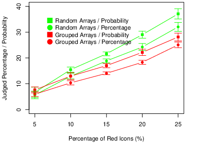
Figure 9: Means of the judgments in Experiment 3, with error bars representing 95% confidence intervals.
The mean SNS score was 3.85 with a standard deviation of 1.04. To assess whether subjective numeracy played a role in participants’ judgments, we repeated the ANOVA with subjective numeracy as a covariate. The only statistically significant effect involving subjective numeracy was the probability × question type × subjective numeracy interaction (F[4,840] = 3.30, p = .011, ηp2 = .015). One way to describe this interaction is as follows. In the percentage wording condition, the correlations between SNS scores and participants’ judgments were minimal, with the strongest being −.08 (p = .399) for arrays with 5% red icons. In the probability wording condition, however, these correlations were stronger overall and increased steadily from −.06 (p = .520) for arrays with 5% red icons to −.21 (p = .030) for arrays with 25% red icons. This is consistent with the general idea that numeracy matters more for the understanding of single-event probabilities than it does for the understanding of relative frequencies.
The results of Experiment 3 are consistent with the idea that random icon arrays are perceived as representing greater percentages and greater probabilities than equivalent grouped icon arrays. Furthermore, the interaction effect in Experiment 3 matches the interaction effect in Experiment 2. As the percentage of red icons increased from 5 to 25%, there was an increasingly large positive effect of random arrays on the perceived percentage of red icons (Experiment 3) and an increasingly large negative effect on risk taking (Experiment 2).
In our laboratory-based risky decision-making task, icon arrays had minimal effect on participants’ overall performance. Those exposed to icon arrays did not earn more points, nor did they distinguish more clearly between expected values — and there was no apparent moderating effect of subjective numeracy. The main difference across conditions was that random icon arrays resulted in less risk taking than either numerical percentages or grouped icon arrays, especially when the loss probability was relatively high (20 or 25%). The results of Experiment 3 are consistent with the idea that this is because random icon arrays are perceived as representing greater percentages and probabilities.
These results are important for three major reasons. One is that they imply that the use of icon arrays to communicate risk does not necessarily lead to better decisions, even among those who are relatively low in numeracy. This is not to suggest that they never lead to better decisions or even that they usually do not. In fact, there are several features of the present studies that might have contributed to the null results. Among them are the following: 1) The participants were young and well educated, and they may have had a good enough understanding of numerical probabilities that the icon arrays did not provide any additional benefit. We should note, however, that our participants’ SNS scores were similar to those reported in previous studies of the general public. 2) We did not measure objective numeracy, graph literacy, or other potential moderating variables that could help to reveal positive effects of icon arrays within some sub-groups of participants. 3) The loss probabilities were relatively high and therefore might have been relatively easy for participants to understand regardless of how they were presented. Icon arrays might be more helpful for probabilities less than 1%, which are often more difficult for people to conceptualize (e.g., Lipkus, 2007). 4) Participants saw either numerical probabilities or icon arrays, but never both. We cannot say, therefore, whether the combination of numerical probabilities and icon arrays might have had some benefit. 5) The task turned out to be quite difficult, with participants’ point totals being close to zero on average and highly variable. It may have simply been too difficult for icon arrays to help. 6) Participants received immediate outcome feedback after trials on which they took a risk, which could have had a disproportionate effect on their decisions. For example, they might have taken risks out of boredom or they might have based their decisions exclusively on their most recent outcomes. An alternative approach would be to present feedback only after each block or only once at the very end of the task. 7) Loss probability and expected value were manipulated in a factorial design. This meant that, in terms of the underlying structure of the task, loss probability was uncorrelated with expected value. An alternative approach would be for loss probability to be correlated with expected value, in which case people might attend to it more and icon arrays might be more helpful.
We should emphasize that these features of the task are not reasons to dismiss the present results. Instead, they imply specific hypotheses that should be tested in future studies to identify conditions under which icon arrays do and do not help people make better decisions. A second reason these results are important is that they suggest a way in which the formatting of icon arrays can affect people’s risk taking. Specifically, random icon arrays — relative to numerical percentages and grouped icon arrays — appear to reduce risk taking. In the present studies, this reduction occurred regardless of the expected value of taking the risk. Thus for negative expected values, random icon arrays led participants to make the more rational decision. In contrast, for positive expected values, random icon arrays led participants to make the less rational decision. This emphasizes the idea that graphical risk communication methods can change behavior in ways that do not necessarily correspond to a “better understanding” of the risk and that the best method to use may depend on the goals of the communicator (e.g., Stone et al., 2017; Stone et al., 2015). For a risk communicator whose primary goal is to reduce risk taking, using random icon arrays could potentially be a useful tool.
Experiment 3 supported one explanation of the risk-reducing effect of random icon arrays. Specifically, people perceive the percentage of icons representing a negative outcome to be greater in random arrays than in equivalent grouped arrays. Similar results have been obtained by Ancker et al. (2011) and are consistent with research in numerosity perception, where visual stimuli that are distributed widely across the visual field are judged to be more numerous than stimuli that are clustered (Allik & Tuulmets, 1991; 1993). Thus when the visual stimuli represent the probability of a loss in a risky decision-making task, it follows in a straightforward way that people should take fewer risks.
Recall that Experiment 3 also showed that when people interpret the percentage of target icons as the probability of randomly selecting one, they judged that probability to be even greater than they judge the corresponding percentage. Again, similar results have been observed in other contexts. For example, when people express their confidence in their answers to general-knowledge questions, they are more overconfident when they respond with the probability that they answered each item correctly than when they respond with the percentage of similar items they would answer correctly (Price, 1998). Similarly, both laypeople and experts judge the risk that a psychiatric patient will commit an act of violence to be greater when they respond with a single-event probability rather than a relative frequency (Slovic et al., 2000).
This raises a particularly interesting issue. It is often claimed that an advantage of icon arrays is that they provide a frequentistic representation of the probability of the negative outcome and that people find frequentistic representations inherently easier to understand (e.g., Gigerenzer & Hoffrage, 1995). However, Experiment 3 suggests that a prompt to think in terms of single-event probabilities (e.g., "What is the probability of selecting a red jelly bean?") can to some extent counteract the benefits of the frequentistic representation. A topic for future research, then, is how different representations of probabilities interact with the type of response that is required. If the response itself is a relative frequency (e.g., "How many treated patients out of 1000 will have a heart attack?"; Galesic et al., 2009), then icon arrays might be quite helpful. But if the response is a single-event probability judgment or a decision whether or not to take a risk on a single occasion, then icon arrays might be less helpful (or possibly not helpful at all).
Finally, we believe that the present paradigm holds promise for better understanding the cognitive processes involved in the perception, interpretation, and use of icon arrays. For example, it could facilitate the use of response time measures, eye tracking, and other process tracing methods (e.g., Kreuzmair et al., 2016). Recall that in Experiments 1 and 2 we recorded how long it took participants to make their decisions. Perhaps the most notable results here were that 1) there was a general increase in response time as the loss probability increased, 2) this effect also had a strong nonlinear component with participants taking somewhat longer to respond for the middle probabilities, and 3) this nonlinear effect was most pronounced for random icon arrays. Future research should continue to explore these results and work toward developing more detailed and accurate cognitive models.
Allik, J., & Tuulmets, T. (1991). Occupancy model of perceived numerosity. Attention, Perception, & Psychophysics, 49(4), 303-314.
Allik, J., & Tuulmets, T. (1993). Perceived numerosity of spatiotemporal events. Attention, Perception, & Psychophysics, 53(4), 450-459.
Ancker, J. S., Chan, C., & Kukafka, R. (2009). Interactive graphics for expressing health risks: Development and qualitative evaluation. Journal of Health Communication, 14(5), 461-475.
Ancker, J. S., Senathirajah, Y., Kukafka, R., & Starren, J. B. (2006). Design features of graphs in health risk communication: A systematic review. Journal of the American Medical Informatics Association, 13(6), 608-618.
Ancker, J. S., Weber, E. U., & Kukafka, R. (2011). Effect of arrangement of stick figures on estimates of proportion in risk graphics. Medical Decision Making, 31(1), 143-150.
Böcherer-Linder, K., & Eichler, A. (2019). How to improve performance in Bayesian inference tasks: A comparison of five visualizations. Frontiers in Psychology, 10, 267.
Brase, G. L. (2014). The power of representation and interpretation: Doubling statistical reasoning performance with icons and frequentist interpretations of ambiguous numbers. Journal of Cognitive Psychology, 26(1), 81-97.
Brust-Renck, P. G., Royer, C. E., & Reyna, V. F. (2013). Communicating numerical risk: Human factors that aid understanding in health care. Reviews of Human Factors and Ergonomics, 8(1), 235-276.
Etnel, J. R., de Groot, J. M., El Jabri, M., Mesch, A., Nobel, N. A., Bogers, A. J., & Takkenberg, J. J. (2020). Do risk visualizations improve the understanding of numerical risks? A randomized, investigator-blinded general population survey. International Journal of Medical Informatics, 135, 104005.
Fagerlin, A., Zikmund-Fisher, B. J., & Ubel, P. A. (2011). Helping patients decide: Ten steps to better risk communication. Journal of the National Cancer Institute, 103(19), 1436-1443.
Fagerlin, A., Zikmund-Fisher, B.J., Ubel, P.A., Jankovic, A., Derry, H.A., & Smith, D.M. (2007). Measuring numeracy without a math test: Development of the Subjective Numeracy Scale (SNS). Medical Decision Making, 27(5), 672-680.
Faul, F., Erdfelder, E., Lang, A.-G., & Buchner, A. (2007). G*Power 3: A flexible statistical power analysis program for the social, behavioral, and biomedical sciences. Behavior Research Methods, 39(2), 175-191.
Galesic, M., Garcia-Retamero, R., & Gigerenzer, G. (2009). Using icon arrays to communicate medical risks: Overcoming low numeracy. Health Psychology, 28(2), 210.
Garcia-Retamero, R., & Cokely, E. T. (2013). Communicating health risks with visual aids. Current Directions in Psychological Science, 22(5), 392-399.
Garcia-Retamero, R., & Galesic, M. (2010). How to reduce the effect of framing on messages about health. Journal of General Internal Medicine, 25(12), 1323-1329.
Garcia-Retamero, R., Galesic, M., & Gigerenzer, G. (2010). Do icon arrays help reduce denominator neglect? Medical Decision Making, 30(6), 672-684.
Gigerenzer, G., & Hoffrage, U. (1995). How to improve Bayesian reasoning without instruction: Frequency formats. Psychological Review, 102(4), 684.
Kreuzmair, C., Siegrist, M., & Keller, C. (2016). High numerates count icons and low numerates process large areas in pictographs: Results of an eye‐tracking study. Risk Analysis, 36(8), 1599-1614.
Lipkus, I. M. (2007). Numeric, verbal, and visual formats of conveying health risks: Suggested best practices and future recommendations. Medical Decision Making, 27(5), 696-713.
Morey, R. D. (2008). Confidence intervals from normalized data: A correction to Cousineau (2005). Tutorials in Quantitative Methods in Psychology, 4(2), 61-64.
Nguyen, P., McIntosh, J., Bickerstaffe, A., Maddumarachchi, S., Cummings, K. L., & Emery, J. D. (2019). Benefits and harms of aspirin to reduce colorectal cancer risk: A cross-sectional study of methods to communicate risk in primary care. British Journal of General Practice, 69(689), e843-e849.
Price, P. C. (1998). Effects of a relative-frequency elicitation question on likelihood judgment accuracy: The case of external correspondence. Organizational Behavior and Human Decision Processes, 76(3), 277-297.
Ruiz, J. G., Andrade, A. D., Garcia-Retamero, R., Anam, R., Rodriguez, R., & Sharit, J. (2013). Communicating global cardiovascular risk: Are icon arrays better than numerical estimates in improving understanding, recall and perception of risk? Patient Education and Counseling, 93(3), 394-402.
Schapira, M. M., Nattinger, A. B., & McHorney, C. A. (2001). Frequency or probability? A qualitative study of risk communication formats used in health care. Medical Decision Making, 21(6), 459-467.
Schneider, S. L., Kauffman, S. N., & Ranieri, A. Y. (2016). The effects of surrounding positive and negative experiences on risk taking. Judgment and Decision Making, 11(5), 424-440.
Shapiro, M. S., Price, P. C., & Mitchell, E. (2020). Carryover of domain-dependent risk preferences in a novel decision-making task. Judgment and Decision Making, 15(6), 1009.
Slovic, P., Monahan, J., & MacGregor, D. G. (2000). Violence risk assessment and risk communication: The effects of using actual cases, providing instruction, and employing probability versus frequency formats. Law and Human Behavior, 24(3), 271-296.
Stone, E. R., Bruine de Bruin, W., Wilkins, A. M., Boker, E. M., & MacDonald Gibson, J. (2017). Designing graphs to communicate risks: Understanding how the choice of graphical format influences decision making. Risk Analysis, 37(4), 612-628.
Stone, E. R., Gabard, A. R., Groves, A. E., & Lipkus, I. M. (2015). Effects of numerical versus foreground-only icon displays on understanding of risk magnitudes. Journal of health Communication, 20(10), 1230-1241.
Trevena, L. J., Zikmund-Fisher, B. J., Edwards, A., Gaissmaier, W., Galesic, M., Han, P. K. J., King, J., Lawson, M. L., Linder, S. K., Lipkus, I, Ozanne, E., Peters, E., Timmermans, D., & Woloshin, S. (2013). Presenting quantitative information about decision outcomes: A risk communication primer for patient decision aid developers. BMC Medical Informatics and Decision Making, 13(2), S7.
Tubau, E., Rodríguez-Ferreiro, J., Barberia, I., & Colomé, À. (2019). From reading numbers to seeing ratios: A benefit of icons for risk comprehension. Psychological Research, 83(8), 1808-1816.
Tymula, A., Belmaker, L. R., Roy, A. K., Ruderman, L., Manson, K., Glimcher, P. W., & Levy, I. (2012). Adolescents’ risk-taking behavior is driven by tolerance to ambiguity. PNAS, 109(42), 17135-17140.
Walker, A. C., Stange, M., Dixon, M., Fugelsang, J. A., & Koehler, D. J. (2020, May 29). Using Icon Arrays to Communicate Gambling Information Reduces the Appeal of Scratch Card Games. https://doi.org/10.31234/osf.io/yt9cm
Wright, A. J., Whitwell, S. C., Takeichi, C., Hankins, M., & Marteau, T. M. (2009). The impact of numeracy on reactions to different graphic risk presentation formats: An experimental analogue study. British Journal of Health Psychology, 14(1), 107-125.
Zikmund-Fisher, B. J., Witteman, H. O., Dickson, M., Fuhrel-Forbis, A., Kahn, V. C., Exe, N. L., Valerio, M., Holtzman, L. G., Scherer, L. D., & Fagerlin, A. (2014). Blocks, ovals, or people? Icon type affects risk perceptions and recall of pictographs. Medical Decision Making, 34(4), 443-453.
We would like to acknowledge the contributions of the members of the Judgment and Reasoning Lab at California State University, Fresno.
Copyright: © 2022. The authors license this article under the terms of the Creative Commons Attribution 3.0 License.
This document was translated from LATEX by HEVEA.