Judgment and Decision Making, Vol. 17, No. 1, January 2022, pp. 215-236
Frequency or total number? A comparison of different presentation formats on risk perception during COVID-19
Yun Jie*
|
Abstract:
Curbing the COVID-19 pandemic remains an ongoing global challenge.
Institutions often release information about confirmed COVID-19 cases by
citing the total number of cases (e.g., 100,000), their (relative) frequency (e.g.,
100 per 1,000,000), or occasionally their proportion (e.g., 0.0001) in a
region. I compared the effect of these three presentation formats — total
cases, frequency, and proportion — on people’s perceived risk. I found
people perceived a higher risk of COVID-19 from a total-cases format than
from frequency formats when the denominators are relatively small, and the
lowest risk from a proportion format. Correspondingly, people
underestimated total infections when given frequency and overestimated
frequency when given total number of cases. Additional comparisons were
made among mathematically equivalent variations of frequency formats
(e.g., 1 in 100, 10 in 1,000, 1,000 in 10,000, etc.). The results provided
qualified support for denominator neglect, which seems to occur in bins
into which denominators are grouped (e.g., 1–1000, 10000–100000), such
that only across bins could participants perceive differences. Finally, a
mixed format of proportion and total cases reduced perceived risks from
total cases alone, while a mixed format of frequency and total cases
failed to produce similar results. I conclude by providing concrete
suggestions regarding COVID-19 information releases.
Keywords: frequency, proportion, total cases, denominator neglect, COVID-19, total number
1 Introduction
Since the beginning of the COVID-19 outbreak, the release of information
regarding the spread of the virus has been a matter of critical
importance. Many governments and media outlets have updated information
about confirmed cases and SARS-CoV2 infection rates daily. For example, the
U.S. Center for Disease Control and Prevention (CDC) releases information
by 8 p.m. EST every day at both the national and state
levels.1
In the CDC’s information releases, total cases are expressed as a single
number, while the infection rate is expressed as cases per 100,000.
Similarly, websites such as https://ourworldindata.org/coronavirus,2 among others,
also have presented the total number of confirmed cases and infection
rates, the latter expressed as confirmed cases per million. Are there
significant differences among mathematically equivalent formats in
conveying the risk of infection? The answer to this question has
implications for the ongoing fight against the global pandemic (Bavel et
al., 2020; Holmes et al., 2020).
In the remainder of this paper, I refer to the total confirmed cases as
the total-cases format and the form of A/B (e.g., 1 in 1,000) as
the frequency format. A third format of a decimal number between
0 and 1 is referred to as the proportion format (e.g., 0.001).
Clearly, proportion and frequency can be converted to each other with no
loss of information, and all three formats can be converted to one another
if population information is available. My research question is: How do
different presentation formats influence people’s perceived risk of
contracting the coronavirus infection in a designated location? An
understanding of differences in people’s perception of the two most
frequently adopted formats in COVID-19 news releases, the frequency format
and the total-cases format, has obvious practical significance in risk
communication during the global pandemic. I also tested the phenomenon of
denominator neglect — people’s tendency to attend to numerators and neglect
denominators when processing probability ratios (Denes-Raj & Epstein
1994) — theoretically in the risk-perception context and delineate its
boundaries.
Past research on risk perceptions has primarily focused on the
frequency-proportion discrepancy, or the fact that people perceive higher
risks from a frequency format than from a proportion format at a given
rate. For example, a psychiatric patient was judged as posing a higher
risk if their likelihood of committing harmful acts was provided as “10
out 100 of similar patients will cause harm” vs. “10% of similar patients
will cause harm” (Slovic et al., 2000). The current
research explores an additional format, total number of cases, which is
arguably the most widely used metric to convey COVID-19 information.
Furthermore, although both the proportion format and the total-cases format
can take only one form, there can be more than one frequency
expression of the same rate when numerators and denominators are varied.
For instance, 0.01 can be expressed as 1 in 100, 10 in 1,000, 100 in
10,000, etc. How do people respond to different frequency expressions with
varying numerators and denominators? Though researchers have studied the
frequency-proportion difference across medical, legal, business,
meteorological, and psychological domains (Koehler, 2001; Peters et al.,
2011; Reyna & Brainerd, 2008; Schapira et al., 2004; Slovic et al., 2000;
Srivastava & Koukova, 2018), less is known about differences in
perceptions of mathematically equivalent frequency formats.
In summary, this study simultaneously compares how three mathematically
equivalent types of information-presentation formats — frequency, total
cases, and proportion — affect people’s perception of the risk of COVID-19.
1.1 Theories and Hypotheses
Research on denominator neglect (also called the ratio bias) shows that
“people who understand that proportion is a function of frequencies in
both the numerator and the denominator still tend to pay less attention to
the denominator as a default.” (Reyna, Nelson, Han & Dieckmann, 2009).
In a classic demonstration of the denominator neglect, Denes-Raj and
Epstein (1994), following Piaget and Inhelder (1951/1975), offered
participants two transparent bowls of white and red jelly beans, and told
them they would win money if they picked a red bean. One bowl contained 10
jelly beans, of which one was red; the other contained 100 beans, of which
nine were red. The researchers found strong evidence for denominator
neglect. That is, although participants knew that the former offered a
higher probability of winning, because they focused on the numerator (9
vs. 1) rather than the denominator, they simultaneously felt that they
were more likely to win in the latter case. In other words, participants
were “following a mental strategy of ‘imagine the numerator’ and
neglecting the denominator” (Slovic, Monahan & MacGregor, 2000, p. 285).
If people partially or completely neglect denominators, we can conclude
that the larger the numerator and denominator, the greater the risk people
will perceive for a given rate. Arguably, the proportion format and the
total-cases format could essentially be interpreted as a frequency format
with denominator 1 and N (the entire population).3 In such cases, denominator neglect leads to two
predictions regarding how different formats affect perceived risk.
H1: For a given rate, perceived risk from the highest to the lowest are
Risktotalcases >
Riskfrequency >
Riskproportion.
H2: Among mathematically equivalent frequency formats, the larger the
numerator (denominator), the greater the perceived risk.
When people are asked to estimate the total number of infected cases from
proportion or frequency, they can rely on a cognition-based strategy or an
affect-based strategy. The cognitive strategy involves simple arithmetic,
the result of which can serve as a benchmark. For instance, a 0.0001
infection rate in a country of 1 billion people equals 100,000 total
cases. However, extensive research finds that perceived risk is instead an
embodiment of feelings and affect (e.g., Loewenstein, Weber, Hsee &
Welch, 2001). At any fixed rate, due to denominator neglect, the
feelings/affect resulting from a proportion (e.g., 0.0001) or frequency
(e.g., 1 in 10,000)4 will be less strong than feelings
resulting from total cases (e.g., 100,000). When proportion or frequency
provided by outside sources produces momentary feeling/affect, and such
feelings/affect are in turn adopted as a basis for the estimate of the
total number of cases, people would underestimate the total number of
cases.
H3a: When presented with information in the form of proportion or
frequency, people tend to underestimate the total number of cases of
infection.5
In predicting people’s perceptions of a given infection rate presented in
different formats, Hypotheses 1 and 2 assume that the participants have
not been to the places mentioned in the scenario; their only source of
information is the presenter (i.e., cognition→perception). How would the
cognitions of those who live in places where the pandemic is ongoing be
affected? That is, conditional on subjective perceptions, how would these
individuals estimate the consequences of the pandemic when elicitation
formats are varied (i.e., perception→cognition)?
Individuals often rely on feelings when making judgments, or an affect
heuristic (Slovic et al., 2007; Kahneman, 2011). Thus, when they are
expressing their subjective feelings/experience verbally in total number
vs. frequency, a smaller total number of reported infections may be
sufficient to match their emotional intensity and perceived seriousness of
the situation, while a higher estimate in frequency is needed to match the
same level of emotion/perception due to denominator neglect. Thus,
conditional on individuals’ actual experience, one could find an opposite
pattern of predictions in H1 in estimating the pandemic situation.
Formally, I predict:
H3b: Individuals who are living through a pandemic in a certain place tend
to estimate the seriousness of the pandemic of that place differently
based on different elicitation formats, such that
Estimatefrequency >
Estimatetotalcases.6
H3a and H3b are indeed different manifestations of the same prediction. H3a
keeps the objective information constant, while H3b keeps the subjective
experience constant. What would happen when one uses the two presentation
formats simultaneously in a presentation of A (B) or B (A) (e.g., the
infection rate is 0.0001 (100,000 people in total))? If format A produces
higher subjective risks than format B, two hypotheses could be proposed:
an accumulation hypothesis and an average hypothesis. An accumulation
hypothesis would specify that a mixed format of A and B would have a
cumulative effect, while the average hypothesis would predict some sort of
weighted average of A and B, such that people will perceive less risk from
the “riskier” format but more risk from the “less risky” format. Hence:
H4a: The mix of proportion or frequency format and the total-cases format
will produce a cumulative level of perceived risks:
Riskmix >
Risktotalcases >
Riskproportion/frequency
H4b: The mix of proportion or frequency format and the total-cases format
will produce a medium level of perceived risks between the two:
Risktotalcases >
Riskmix >
Riskproportion/frequency
In addition to denominator neglect, a second theory, exemplar cuing theory,
predicts a different pattern for risk perception (Koehler & Macchi,
2004). Koehler and Macchi (2004, p. 540) propose that “people attach more
weight to unlikely events when they can easily generate or imagine
examples.” They studied frequency formats in the context of incriminating
DNA match, in which blood drops matched the DNA of a murder suspect, and
found that a presentation with no exemplars greater than 1 (e.g., 0.001%
of the people in a town of 500 who are not the blood source would match
the blood drops of the suspect; 0.001%×500 < 1, no
exemplar available) is more convincing evidence of a defendant’s guilt
than a presentation with exemplars greater than 1 (e.g., 0.001% of the
people in a town of 5,000,000 who are not the blood source would match;
0.001%×5,000,000 = 50 exemplars available). Crucially, their
Experiment 2 showed that the availability of exemplars is important, but
the number of exemplars is not (e.g., people are indifferent between 1 in
1,000 and 2 in 1,000). As the authors argued in a footnote on page 545,
people are indifferent when a given ratio is provided as different
frequency formats in the DNA match setting (e.g., 1 in 1,000, 10 in
10,000, and 10,000 in 1,000,000,000). If the finding extends to risk
perceptions in the health domain, it would predict no differences among
the different presentation formats, since all are mathematically
equivalent in producing exemplars. For instance, if the infection rate in
a country of 1,000,000,000 was 0.0001, then the exemplars in all three
presentations are 10,000, equal to the total cases. Obviously, in order to
imply at least one exemplar for a low-probability event, the reference
class (i.e., how many people could be potentially infected) should be
large enough that there exists at least one exemplar. Thus, a competing
hypothesis of H1 is:
H5: Given that there is at least one exemplar, all mathematically
equivalent presentation formats of infection information will produce the
same level of perceived risk because they imply the same number of
exemplars.
1.2 Empirical Overview
In five studies, I explored the effects of different presentation formats
on individuals’ risk perceptions of COVID-19. Study 1 kept respondents’
subjective experience unchanged and explored how their estimates of
infection rates varied according to different elicitation formats
within-person in a survey carried out in China
(H3b). Studies 2–4, using between-subject designs and
experimental manipulations, addressed my main research question of whether
and how people’s perceived risk varies by presentation format (H1, H2,
H3a, and H5); in these studies, I kept information mathematically
equivalent across groups. In Study 2, I compared different frequency
formats by varying the numerators/denominators and compared total-cases
formats by adding and removing population information. In Study 3, I
adopted a nine-group design by systematically varying the denominators and
numerators of the frequency formats. Finally, Studies 4a and 4b further
explored mixed formats on risk perception using 100-point scales (H4a and
H4b).
2 Study 1
Study 1 used a non-experimental paradigm to explore how subjective
experience mapped onto self-reported ratings. It tested H3b, which
predicts that people would estimate the seriousness of the pandemic
happening around them differently when two different elicitation formats
of frequency and total cases were used. Study 1 adopted a
within-subjects design in a natural setting during the peak of the
COVID-19 pandemic in China. The within-subjects design provides a
stringent test of the hypothesis that
Estimatefrequency >
Estimatetotalcases.
2.1 Method
Study 1 used a convenient online sample from China7 (N = 119; 54 females,
Mage = 25.06, range = 18 to 54; located over 16
provinces) during the peak of the COVID-19 pandemic in 2020 (all data
collected on January 29 and 30, 2020). The unique time window enables us
to test H3b, for the pandemic was unexpected and sudden to citizens living
in China, and no institutions were reporting infected cases daily yet.
Therefore, participants answered their questions with little influence
from official statistics.
Participants answered a series of questions related to the COVID-19
pandemic, two of which were of concern to this study. The first question
concerned the total number of infections: “Among the 1.4 billion people in
China, how many do you predict will get infected eventually?” (options:
“fewer than 1,000,” “1,000–10,000,” ... “100 million–1 billion”). The
second question concerned the frequency of infection against a smaller
denominator: “On average, how many people will get infected out of 100,000
people in the entire nation?” (options: “fewer than 1,” “1–10,” . . .
“10,000–100,000”). The order of the two questions was counterbalanced.
I examined whether participants provided consistent answers to these
two questions. That is, given an answer to one question, there is a
normatively correct answer to the other question. For instance, an answer
of “1,000–10,000” to the first question should correspond to “fewer than
1” to the second question; an answer of “10,000–100,000” to the first
question should correspond to “1–10” to the second question, and so on.
2.2 Results
Most of the answers to the first question were “1,000–10,000” (coded as 2,
29.41%) and “10,000–100,000” (coded as 3, 60.50%), with a mean of 2.89
and standard deviation of 0.94. Most of the answers for the second
question were “1–10” (coded as 2, 41.18%) and “10–100” (coded as 3,
21.85%), with a mean of 2.62 and standard deviation of 1.24. In other
words, most (89.91%) respondents to the first question thought that the
total number of infected patients would eventually fall between 1,000 and
100,000; in contrast, most (63.03%) respondents thought that the
infection rate was “1–100” people per 100,000, equal to 14,000 to 1.4
million of China’s population.
Next, I inspected the individual-level data. Among the 119
participants, 64.71% answered the questions inconsistently. If I used the
total number as my benchmark, more than half (52.95%) of the respondents
overestimated the frequency of infection, while the remaining 11.76%
underestimated it. An exact binomial test of the equal likelihood of
consistent and inconsistent predictions yielded a p = 0.0017,
indicating that the majority were inconsistent; an exact binomial test of
the equal likelihood of overestimation and underestimation yielded a
p < 0.001, showing that participants were more likely
to overestimate than underestimate infections in a frequency format.
2.3 Discussion
Study 1 showed that people were inconsistent within-subjects in
estimating the pandemic consequences when the same question was asked as a
total-cases estimate vs. a frequency estimate. Given the predicted total
number of infected patients as the benchmark, people overestimated
frequency. Likewise, if the predicted frequency serves as the benchmark,
people underestimated the total number of infections. Having established
that total cases and frequency can lead to different estimates even when
the experienced event remains unchanged within-person, Studies
2–4 focus on my main research question: Do different presentation formats
lead to different levels of perceived risk? Note that unlike in Study 1,
in the subsequent studies, participants’ information about the focal
place’s pandemic situation came only from the researcher.
3 Study 2
3.1 Method
I randomly assigned 355 CloudResearch-approved
(https://www.cloudresearch.com/) MTurk participants into five
conditions (frequency formats with numerators 1/10/100, total cases
with/without population information; preregistered at
https://aspredicted.org/blind.php?x=6ap9v7). Except for the
total-cases-without-population-information condition, the other four
conditions were mathematically equivalent. Overall, 350 participants (173
female; Mage = 39.61, SD = 11.25) passed
the attention check; thus, I analyzed these participants in my subsequent
analyses.
Participants read the following scenario: “Suppose you are doing
business in a foreign country of 1 billion [bolded in
the original material] population. You need to make an urgent business
trip to this country, and travel to multiple cities. However, you are
hesitating because of COVID-19 there. According to a credible information
source, you know that 1/10/100 in every 10,000/100,000/1,000,000
people were currently infected.” In the total-cases groups, the bolded
part read “100,000 people in total were currently infected in this
country.” The country’s population information was not revealed in the
total-cases-without-population-information condition.
After reading this scenario, participants were asked to answer three
questions on five-point scales: (1) How risky do you perceive it is to
travel in this country, from not risky at all to extremely risky?
(measuring perceived risk) (2) How likely do you think you are to get
infected, from not likely at all to extremely likely? (measuring perceived
likelihood of infection), and (3) How likely are you to make the trip,
from not likely at all to extremely likely? (measuring intention to make
the trip). My focus is on perceived risks; I included the other two items
to cross-validate that subjective risks were related to these two
constructs. Additionally, I required participants in the three frequency
formats to estimate “the total number of people who are currently infected
out of 1 billion people.” All participants were explicitly required to
“choose an answer as quickly as possible based on feelings without doing
much deliberation,” from 1,000, 10,000, … , to 10,000,000.
3.2 Results
I first analyzed perceived risk group by group. For readers’ convenience, I
abbreviate the five groups as num1 (numerator equals 1), num10 (numerator
equals 10), num100 (numerator equals 100), totwithp (total cases with
population information), and totwithoutp (total cases without population
information) in the analyses below. The average perceived risk of five
groups is shown in Figure 1. Contrary to the prediction of denominator
neglect, I found no perceived risk differences among the three frequency
formats (F(2, 204) = 0.53, p = 0.59), although there
were significant differences among all five groups (F(4, 345) =
6.21, p < 0.001). To my surprise, I found no difference
between groups in the total-cases format with and without population
information (t(141) = –1.31, p = 0.19), providing
evidence of denominator neglect. Post-hoc pairwise comparison using
Tukey’s Honest Significant Test revealed that most of the difference among
the five groups was driven by the two total-cases groups vs. the three
frequency groups (totwithp vs. num100, p adjusted = 0.036;
totwithoutp vs. num1, p adjusted = 0.013; totwithoutp vs. num10,
p adjusted = 0.002; totwithoutp vs. num100, p adjusted =
0.0003).
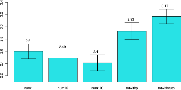
| Figure 1: Perceived risks of different groups in
Study 2. The error bars represent ± one standard error. The first three
groups refer to frequency formats with numerator 1, 10, and 100
respectively. The fourth and fifth group refer to total-case formats
with/without population information. |
Next, I calculated the effect size Cohen’s d of each group against the
first group of num1: Dnum10 = –0.10;
Dnum100 = –0.17;
Dtotwithp = 0.31;
Dtotwithoutp = 0.56 (see Figure 3 in Study 3
below). I further analyzed participants’ estimate of the total number of
infections in the three frequency formats and found no significant
differences (Mnum1 = 3.00,
Mnum10 = 2.74,
Mnum100 = 2.83, F(2, 204) =
1.09, p = 0.34). Out of 207 participants, 45.9% estimated
correctly, 30.9% underestimated total infections, and 23.2%
overestimated. A test of equal distribution obtained results in the
predicted direction: more participants underestimated vs. overestimated
the total number of infections (60.4% vs. 39.6%, Exact Binomial Test
p = 0.078).
Finally, perceived risk and perceived likelihood of infection were
positively correlated (r = 0.77, t(348) = 22.84,
p < 0.001), and perceived risk and trip intention were
negatively correlated (r = –0.63, t(348) = –14.94,
p < 0.001). The results of the perceived likelihood of
infection and trip intention reflected a similar pattern: no significant
differences emerged among the three frequency formats; there was a boost
in perceived likelihood of infection and a reduction in trip intention for
the two total-cases formats.
3.3 Discussion
Overall, Study 2 showed partial support for denominator neglect. I found no
differences in perceived risk among the frequency formats when I varied
the numerators from 1 to 1,000. When I adopted the total cases,
participants perceived significantly higher risk, regardless of whether
population was explicitly stated or not. This finding provides evidence
for denominator neglect: the non-significant result implies that
people largely ignored the total population — the denominator, in
the total-cases format — when normatively they should take this
piece of information into account. Past research showed that explicitly
stating the frequencies by placing both numerators and denominators side
by side could eliminate denominator neglect (Price & Matthews, 2009).
This study has replicated this finding.
My next study has four purposes. First, I systematically increased the
numerator in the frequency formats from 1 to 100,000 to replicate Study
2’s null results among frequency formats. Second, I have added a
proportion format in an attempt to replicate the literature that
proportion format conveys lower risk. Third, I tested Hypotheses 4a and 4b
regarding the effect of mixed formats. Fourth, given that total cases can
be expressed in two ways, as a mere total number or by the frequency
format of “n out of N,” I examined whether this subtle difference affects
perceived risk. The major difference is that in the total-cases format,
the population information is a few sentences apart from the numerator,
whereas in the frequency format, both pieces of information were placed
side by side, possibly increasing the salience of the denominator and
therefore decreasing denominator neglect (Price & Matthews, 2009). Note
that population information is always provided in the remaining studies in
the first sentence: “Suppose you are doing business in a foreign country
of 1 billion population.”
4 Study 3
4.1 Method
Six hundred and thirty-seven CloudResearch-approved MTurk participants were
randomly assigned to nine mathematically equivalent conditions (frequency
formats with numerators 1/10/100/1,000/10,000/100,000, total cases with
population information, proportion, mix of proportion and total cases;
preregistered at https://aspredicted.org/blind.php?x=4dv2fn).
Overall, 622 participants (322 female; Mage =
42.14, SD = 12.96) passed the attention check; thus, I analyzed
these participants in my following analyses.
The instructions were similar to those in Study 2, with a few differences
in the experimental manipulations. First, for the frequency format with
numerator 100,000, I explicitly used an A out of B format — “100,000 out of
the 1,000,000,000 people are right now infected.”8
Second, in all groups, I emphasized that infection rate referred to the
“situation in the moment.” Third, in the mixed-format group, a proportion
was followed by the total cases in parentheses — “the infection rate right
now in this country is 0.0001 (100,000 people in total are infected).”
Fourth, the differences between the total-cases and frequency formats with
population as the denominator are (1) the numerator and denominator were
presented apart in the total-cases format (see instructions in Study 2) and
(2) the denominator was mentioned one more time in the frequency format by
being placed side by side with the numerator.
4.2 Results
Study 3 replicated Study 2’s results: The likelihood of infection and trip
intention were highly correlated with risk perception
(rrisk-infection = 0.77,
p < 0.001;
rrisk-intention = –0.64,
p < 0.001) and displayed similar patterns as perceived
risk (more below). As a result, I focus on the analyses of perceived risk
from here on.
The perceived risk of the nine groups is displayed in Figure 2. Overall,
there were significant differences among the nine conditions (F(8,
613) = 9.29, p < 0.001). The first seven frequency
conditions can be divided into two “Groups” (rendered as such to
differentiate them from experimental groups) with the first four smaller
numerators (num1-num1,000) constituting Group One and latter three
(num10,000, num100,000, and total cases) constituting Group Two.
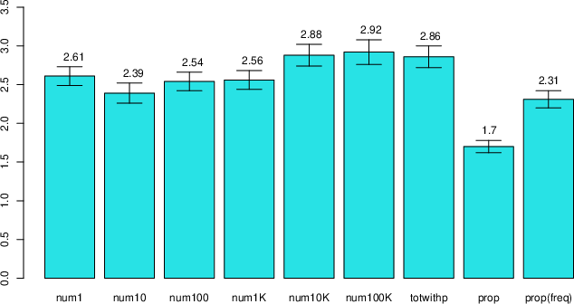
| Figure 2: Perceived risks in different groups.
Error bars represent ± one standard error. All groups convey
mathematically equivalent information. The first six groups refer to
frequency formats with a numerator of 1–100,000. The final groups refer to
a mixed format of proportion and total cases. |
Figure 2 shows the following results. First, there were significant
differences among the first seven frequency groups (F(6, 474) =
2.46, p = 0.024). Second, there were no significant differences
among the first four experimental conditions in Group One (F(3,
276) = 0.619, p = 0.603), replicating Study 2’s results. Third,
there was a discernable increase in perceived risk from Group One to Group
Two. That is, there was an increase in risk perception when the numerator
increased from 1,000 to 10,000 (t(134) = 1.79, p =
0.038, one tail) or 100,000 (t(131) = 1.81, p = 0.036,
one tail). Fourth, there were no significant differences among the three
groups in Group Two (num10,000, num100,000 and total cases) (F(2,
198) = 0.043, p = 0.958). Fifth, the proportion format indeed
lowered risk perception by a large margin as compared to all the other
formats. Sixth, mixing the proportion and the total cases resulted in a
medium level of perceived risk. I ran a planned linear contrast with the
last three groups, with contrast code –1, 0, and 1 for the three groups of
proportion, mixed format, and total number. There was a significant upward
linear trend among the three groups (t(210)) = 7.30, p
< 0.001). Figure 3 displays effect sizes across Studies 2 and 3.
All effect sizes were computed as Cohen’s d against the frequency format
of 1/10,000.
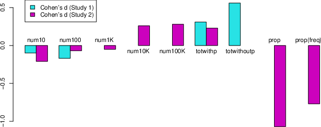
| Figure 3: Effect size Cohen’s d in Studies 2 and 3.
Cohen’s d was computed against the group of frequency format of 1/10,000.
The first six groups refer to frequency formats with numerator 1–100,000.
Totwithp and totwithoutp refer to total case formats with and without
population information, respectively. The final group refers to a mixed
format of proportion and total cases. |
Finally, I analyzed participants’ estimates of the total number of
infections in the first five groups (num1 to 10,000).9 Among the 346 participants, 45.7% correctly estimated the
total number of infections. Among the rest of the participants, who
estimated incorrectly, 67% underestimated the total number of infections,
evidence that frequency display is more likely to result in underestimation
(vs. overestimation) of the total number (67% vs. 33%, Exact Binomial
Test p < 0.001).
4.3 Discussion
The results of Studies 2 and 3 provide qualified support for denominator
neglect. I found that denominator neglect occurs in a stepwise rather than
continuous manner. When the numerators were from 1–1,000, participants
generally perceived similar levels of risk; when the numerators increased
to 10,000 and above, their perceived risks increased and then remained
stable. Both studies showed that total cases enhanced perceived risk over
the frequencies with numerators up to 1,000, and the proportion format
reduced perceived risk.
The literature also documented a 1-in-X effect, such that among frequency
formats, individuals perceived higher risks when the numerator equals 1
(e.g., 1/200) as compared to other numbers (e.g., 5/1,000) (Pighin et al.,
2011). A careful inspection of negative effect sizes of the first three
groups in Figure 3 revealed that the 1-in-X effect may exist at a
small magnitude, though no significant results were obtained. However, when
the denominator is large (over 1,000), the 1-in-X effect is likely to be
overshadowed by denominator neglect. This finding is consistent with
evidence of a relatively small 1-in-X effect (Sirota et al.,
2014). However, my effect size is still smaller than that of their
meta-analysis (Hedges’ g = 0.42, 95% CI 0.29–0.54), possibly due to the
fact that denominators in my groups grew exponentially (in the orders of
10); therefore, the 1-in-X effect was quickly confounded by denominator
neglect.
One limitation shared by Studies 2 and 3 is that they used a five-point
scale, where the majority of participants picked 2s (slightly risky) and 3s
(moderately risky). To better calibrate the effect size, I adopted a
100-point scale in Study 4. More importantly, because the total-cases
format is widely practiced, the finding that the mixed format of total
cases and proportion can reduce perceived risk is worthy of replication.
5 Study 4a
Similar to Study 3, the mixed format in Study 4a is presented by placing
two formats side by side — “Format A (Format B).” I counterbalanced the
order of the total cases and proportion to control for any order effect. I
have included the proportion format alone and the total-cases format alone
as control groups.
5.1 Method and Results
Four hundred and seven CloudResearch-approved MTurk participants were
randomly assigned to four mathematically equivalent conditions (proportion,
proportion [total cases], total cases [proportion], total cases;
preregistered at https://aspredicted.org/blind.php?x=f3g69g). For
example, a “proportion [total cases]” item might read “The infection rate
right now in this country is 0.0001 (100,000 people in total are right now
infected in this country).” Three hundred and ninety-eight participants
(217 females; Mage = 40.65, SD = 12.34)
passed the attention check, so I analyzed this sample in my subsequent
analyses. I adopted a similar scenario as in Studies 2 and 3, except that
perceived risk was measured on a 100-point scale ranging from 0 (“not risky
at all”) to 100 (“extremely risky”), with a starting position at the
midpoint (“moderately risky”). I also included a question to check whether
participants had been vaccinated against COVID-19.
Participants perceived similar levels of risk among the first three groups
(Riskproportion = 26.87,
Riskproportion(totalcases) = 32.17,
Risktotalcases(proportion) = 30.39, comparison
among the three groups F(2, 293) = 0.89, p = 0.41), but
the perceived risk rose significantly in the total-cases condition
(Risktotalcases = 48.76, comparison among all
four groups F(3, 394) = 11.65, p < 0.001).
Figure 4 shows the distributions of perceived risks across groups. The
proportion format produced the lowest perceived risk, though statistically
it did not differ from the other two mixed-format conditions; the
total-cases presentation again significantly elevated risk perception.
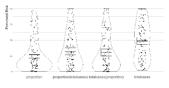
| Figure 4: Perceived risks related to different
mathematically equivalent presentation formats of infection information.
Horizontal bars show means, bands (around the means) show 95% confidence
intervals, dots show raw individual data, and beans show smoothed density
curves. |
Next, I tested the hypothesis that proportion format would lead to
underestimation (vs. overestimation) of the total number of infections.
Among 94 participants in the proportion-format group, 68 (72.3%) wrongly
estimated the total number of infections. Among these 68 participants,
88.2% underestimated; only 11.8% overestimated (Exact Binomial Test
p < 0.001). Recall that in Studies 2 and 3, 60.4% and
67% of participants in the frequency groups, respectively,
underestimated. The likelihood of underestimation was much higher in the
proportion group than in the frequency group (an equal-proportion test
against the result in Study 2 (χ2(1) = 14.37, p <
0.001); against Study 3 (χ2(1) = 10.27, p <
0.001), evidence consistent with a lower perceived risk from proportion
than frequency.
Finally, perceived likelihood of infection was positively (r =
0.82, t(396) = 27.99, p < 0.001) and trip
intention was negatively (r = –0.64, t(396) = –16.41,
p < 0.001) correlated with perceived risk. Both
measures reflect similar patterns as perceived risk. That is,
participants’ trip intention was significantly lower in the total-format
group than in the three other groups. I then ran the same tests with a
sub-sample (N = 279) that excluded participants who had received
vaccination. The pattern remained essentially unchanged (for perceived
risk, Riskproportion = 29.52,
Riskproportion(totalnumber) = 28.72,
Risktotalnumber(proportion) = 32.08,
Risktotalnumber = 48.76; comparison among the
first three groups F(2, 206) = 0.26, p = 0.77;
comparison among all four groups F(3, 275) = 9.13, p
< 0.001). Surprisingly, vaccination did not lower participants’
perceived risk (Riskvaccinated = 33.02 vs.
Risknotvaccinated = 35.43, t(396) =
0.74, ns)).
5.2 Discussion
Study 4a showed again that placing a proportion format side by side with
total number of cases significantly reduced perceived risks from total
cases alone, almost to a similar level of presenting proportion alone. I
found no differences between the two mixed-format groups, so presentation
order did not affect perceived risks. As shown in Figure 4, participants
perceived the risk from the total cases as moderately risky (around 50),
while participants in the first three groups perceived about 3/5 (around
30) of the risk level from the total-cases format. Interestingly, an almost
identical ratio is obtained in Study 3:
Riskproportion = 1.70 vs.
Risktotwithp = 2.86, the former being three-fifths
of the latter. In sum, the evidence indicated that people in a proportion
format perceived only 60% of the risk level from the total-cases format,
although the information contained in both formats was mathematically
equivalent.
6 Study 4b
Study 4a found that the mixed format of proportion and total cases
significantly reduced the perceived risk from the total cases. Study 4b
explores the combination of frequency and total cases by adopting the same
design as in Study 4a, only changing the proportion expression of “the
infection rate right now in this country is 0.0001” to a frequency
expression of “the infection rate right now in this country is 1 in
10,000.”
6.1 Method and Results
Four hundred and four CloudResearch-approved MTurk participants were
randomly assigned into four mathematically equivalent conditions
(frequency, frequency (total cases), total cases (frequency), total cases;
preregistered at
https://aspredicted.org/blind.php?x=f3g69g.
Three hundred and ninety-one participants (198 females;
Mage = 40.65, SD = 11.81) passed the
attention check; I analyze these participants below.
I replicated the finding that total cases produce higher perceived
risks than frequency (Risktotalcases = 45.49 vs.
Riskfrequency = 36.92, t(192) = 2.03,
p < 0.05). However, Figure 5 shows that the two mixed
formats (Risktotalcases(frequency) = 45.61;
Riskfrequency (totalcases) = 44.83) do not differ
significantly from the other two groups. An omnibus test of differences
among groups did not reach conventional significance (F(3, 387) =
2.0, p = 0.114 ).
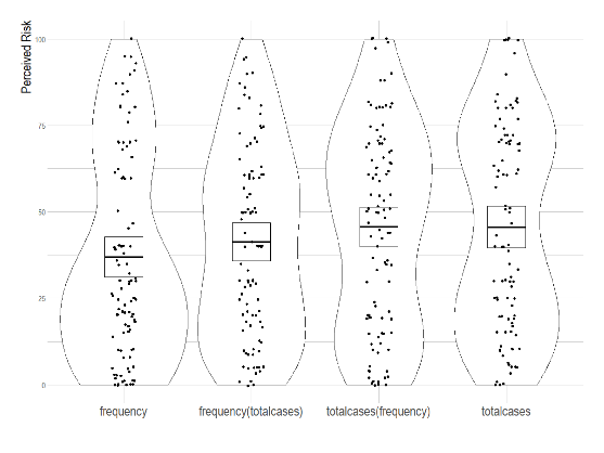
| Figure 5: Perceived risks related to different
mathematically equivalent presentation formats of infection information.
Horizontal bars show means, bands (around the means) show 95% confidence
intervals, dots show raw individual data, and beans show smoothed density
curves. |
6.2 Discussion
Because risk perceived from mixed formats generally falls between the
two non-mixed formats, the smaller reduction of frequency against total
cases may contribute to the null effect of the mixed format: the magnitude
of reduction in perceived risk by frequency alone is 8.57, compared with
21.89 by proportion in Study 4a. In conclusion, this study failed to
detect any significant differences for the mixed formats (vs. frequency or
total cases). In particular, when one adds frequency to total number of
cases, it could not reduce perceived risk from the total-cases format.
7 General Discussion
How do different presentation formats of the same COVID-19 information
affect people’s perceived risks of infection? Most of my results suggest
that people are affected by denominator neglect, but important deviations
emerged.
7.1 Frequency vs. Total Cases
Denominator neglect predicted a relationship of
Risktotalcases >
Riskfrequency >
Riskproportion (H1), which is supported in my
studies only when the numerators of frequencies are relatively small. The
finding of Risktotalcases >
Riskfrequency is particularly important because
most current information releases adopt these two formats, with some media
using them simultaneously. Therefore, communicators should not treat them
as equivalent; they need to carefully choose between them. Consistent with
this finding, my results provided support for H3a, that people tend to
underestimate the total number of cases when provided with the
frequency/proportion data.
Below, I offer some advice for communicators choosing among formats when
releasing information. A general rule of thumb is to report total cases to
increase perceived risk and to report frequency/proportion to reduce
perceived risk.
-
If the goal is to make sure people know the total number of cases,
directly providing the total number of cases is advised.
- If the goal is to reduce perceived risk to the minimum, a proportion
format should be used.
- If the goal is to reduce perceived risk and the proportion format is
for some reason not applicable, then adopting a frequency format with a
small numerator is advised (below 1,000). In addition, the 1-in-X effect
suggests not to use 1 as the numerator.
- If the goals are to make sure people know the total number of cases
and to reduce perceived risk, then using a mix of
proportion and total-cases formats is advised.
Denominator neglect also predicts higher perceived risks for larger
numerators among mathematically equivalent frequency formats (H2). This
prediction was partly supported. The results of Study 3 showed that
perceived risks were similar among formats with numerators 1, 10, 100, and
1,000 (Group One), as well as between numerators 10,000 and 100,000 (Group
Two). In addition, there was a discernable increase from the former
“Group” to the latter. The fact that no differences were detected within
“Groups” offers strong evidence that participants paid attention to both
numerators and denominators when processing those numbers.
This null finding replicates Price and Matthews (2009), who found no
detectable differences when participants saw both numerators and
denominators in frequency formats when the authors varied denominators
from 10 to 1000 with fixed ratio of 10% or 30% (Studies 3 and 4). Their
interpretation is that when both numerators and denominators are made
saliently by being displayed explicitly, denominator neglect disappears.
In the current studies, I have varied the denominators from 10,000 to
1,000,000,000, using the same frequency format with a fixed ratio of
0.0001. I found null effect within “Groups” and denominator neglect across
“Groups,” thereby extending Price and Matthews’ (2009) findings. In other
words, denominator neglect won’t necessarily disappear when both
numerators and denominators are made explicit; in some cases, when the
numerators or denominators are large enough, the effect can still occur
when comparing to frequencies of smaller numerators/denominators.
The null finding is unlikely to be explained by small differences among
numerators, for the differences among the numerators were, in fact, large.
It is also unlikely to be attributed to lack of statistical power, because
my effect-size estimates from both Studies 2 and 3 showed nearly zero
effect within “Groups.” Since exemplar-cuing theory predicted no
difference among all formats (H5), my empirical results can also be
interpreted as partially supporting both denominator neglect and exemplar
cuing. Alternatively, because the fractions presented in Price and
Matthews’ (2009) studies, as well as in the current study, afforded easy
simplifications by eliminating zeros from both numerators and
denominators, an explanation through an elimination heuristic might
explain the null denominator neglect for numerators smaller than
10,000.10 If
so, the present results suggest that the heuristic of eliminating zeros
would be more difficult to apply for larger numbers.
Conceptually, frequency and total cases proposed in this project resemble
the “day format” and “year format” in Bonner and Newell (2008), who found
that presenting the number of deaths from different diseases per year
instead of per day increased subjective risk. An important difference
exists: the formats studied in the current paper offer a description of
the same COVID-19 state of a designated location at a certain moment, and
conversions among the three (proportion, frequency, total cases) are
purely mathematical. In contrast, conversion between the day and the year
format needed an additional time factor. Because the time factor is
arbitrary (one could choose a week, month, year, decade, etc.), what is
counted as a “total number” was not clearly defined in Bonner and Newell
(2008). In our context, the total number is clearly defined and agreed
upon by readers. One might even think of the day vs. year manipulation as
a specific case of frequency formats with different denominators of 1 day
and 1 year/365 days. Notably, the findings in this article also diverged
from those in Bonner and Newell (2008): They found that subjective risk
varies when denominators vary, while I identified exceptions when people
are not affected by denominator neglect.
Finally, although I have provided format recommendations based upon
empirical findings in this research and upon different goals one
has adopted, there is a caveat: The recommendations proposed in this paper
may bias or distort understanding of the true state of affairs (for
instance, using a denominator larger than the actual population would be
quite misleading). Future studies are needed to identify which
representations are likely to provide the most accurate sense of the true
state of affairs. Nevertheless, what constitutes a “true state of affairs”
and whether we can really know it is an epistemic (or perhaps
ontological?) issue beyond the scope of the current research.
7.2 Mixed Format of Proportion/Frequency and Total Cases
H4b predicted that a mix of proportion format and total-number format would
lead to an intermediate level of perceived risks:
Risktotalcases >
Riskmix >
Riskproportion/frequency. This prediction for
mixing proportion and total cases was generally supported in
Studies 3 and 4a, whereas the intermediate hypothesis was not supported
for frequency and total cases. One difference between Studies 3
and 4a is that Study 3 showed an intermediate level of risk, while Study
4a showed effects close to those in the proportion group. Future studies
are needed to explore what factors determine the weight of each component
format on the mixed format. From these results, one can conclude that
people do not perceive accumulated risks from a combination of
presentation formats (H4a rejected); rather, they perceive the information
as if they are doing a weighted average (H4b supported).
This finding has high practical significance. Given that most institutions
are currently using the total-cases format, which leads to the highest
perceived risk among mathematically equivalent alternatives, a mixed
format can be used if communicators aim to reduce perceived risk and
prevent public panic. Again, if the goal is to reduce perceived risk while
still objectively releasing the total number of cases of COVID-19, a mixed
format of total cases with proportion is recommended; if the goal is to
solely reduce perceived risks and prevent panic, a proportion or frequency
format can be used.
Interestingly, although the proportion format leads to the lowest perceived
risk, it appears to be much less frequently used in the real world, except
in the case of fatality rates. One reason may be that infection rates are
often small, and a rate expressed as a proportion is too difficult for
people to process (Gigerenzer, 1994; Gigerenzer & Hoffrage, 1995). For
instance, people may have a hard time understanding the difference between
a rate of 0.0001 and 0.00001, while converting it back to frequency
facilitates understanding (1 in 10,000 or 1 in 100,000). Regardless, I
recommend the proportion format if the sole goal is to reduce subjective
risk.
7.3 What Are Participants’ True Predictions?
In Study 1, I found that people overestimated frequency if the predicted
total number served as a benchmark and underestimated the total number if
the predicted frequency served as a benchmark (H3b). It seemed to the
participants that the idea of 100,000 people becoming infected (out of 1.4
billion) was more difficult to accept than 10 people out of 100,000 getting
infected, even though the former ratio is objectively smaller. It is,
however, less clear whether this bias results from an underestimation of
the total number of infections, an overestimation of the infection rate, or
both. In addition, it is unclear which format reflects an individual’s true
prediction. For participants who were inconsistent, one cannot argue that
both predictions reflected their true cognition. Is it a sort of
constructed estimate, similar to constructed preferences (Bettman et al.,
1998) or constructed attitudes (Schwartz, 2007)? This is a question that
future research should address.
A possible explanation is that people do not have a stable estimate of
how many people are getting infected; instead, they perceive risks as
feelings (Loewenstein et al., 2001) and translate them into different
quantitative estimates for different scales. This interpretation is
consistent with the finding in past research that response scales affect
judgment (Slovic & Monahan, 1995; Slovic et al., 2000). There are two
major differences, however, between the methods of Study 1 in this article
and those of Slovic et al. (2000). First, I compared the two most
frequently adopted formats in COVID-19 information releases, total cases
and frequency, while they compared proportion and frequency. Second, my
Study 1 adopted a within-subjects design, while Slovic and
coauthors used between-subjects designs. The within/between difference is
worthy of attention, for a within-subjects inconsistency strongly implies
irrationality. Indeed, Kahneman (2011) predicted that denominator neglect
“would surely be reduced or eliminated” (p. 329) when the two formats were
directly compared. What is surprising here is that the effect persisted
when the two questions were placed together.
7.4 Conclusion
When institutions release information about COVID-19, the two most
frequently adopted metrics are the total number of cases and the frequency
of cases. Research comparing these two formats has been lacking. My
findings show that these two formats are not equivalent: the total-cases
format generally led to higher perceived risk than the frequency format.
Theoretically, I have provided support for the theory of denominator
neglect in demonstrating Risktotalcases
> Riskfrequency >
Riskproportion, given that numerators/denominators
in the frequency formats are relatively small. These findings can provide
guidance for format choices in the release of information about COVID-19.
Denominator neglect alone, however, cannot explain my observations
among frequency formats. In Studies 2 and 3,
denominator-neglect-induced differences were only observed after crossing
several orders of magnitude. For example, 1 in 10,000, 10 in 100,000, and
100 in 1,000,000 were perceived similarly in Study 3, while significant
differences began to emerge when the numerator crossed a threshold of
10,000. In fact, if one sees proportion 0.0001 as a frequency format with
denominator 1, a threshold theory could reconcile previous
findings of both the existence of a frequency-proportion gap and null
effects among mathematically equivalent frequency formats (Koehler &
Macchi, 2004): when the numerators were within a certain range,
participants perceived similar levels of risks; they started neglecting
denominators when they crossed that range, usually by several orders of
magnitude. Such an interpretation explains, to take a concrete example
from Study 3, the difference between 0.0001 and 10 in 100,000,
and no difference between 10 in 100,000 and 100 in 1,000,000. The
numerator of the former crossed five orders of magnitude, while the latter
crossed only one order.
Essentially, my interpretation is a categorization one: People may perceive
a certain range of infections as small or acceptable and other ranges as
severe or serious. However, it remains unclear exactly how such ranges
function. Although in Study 3, risk perception made a discernable jump
from numerator 1,000 to numerator 10,000, the evidence so far only
supports the assertion that there may be a threshold between 1,000 and
10,000 where a qualitative change in risk perception takes place. We do
not yet know whether this is a case specific to COVID-19 or a general rule
for risk perception as numerators increase. Further studies are needed to
determine the mechanism of change in risk perception when numerators
change in finer scales. Although varying levels of difficulty in
eliminating zeros may be one mechanism for the stepwise pattern, more
process evidence is needed to validate whether this actually occurs and
how exactly such elimination works. There may also be important individual
differences. All these issues await further research. By contrast, I hold
more confidence in the differences between total cases and frequency
identified in this research. In addition, adding a proportion to total
cases can reduce perceived risk from total cases alone. Both findings are
likely to persist in settings beyond COVID-19.
References
Bavel, J. J. V., Baicker, K., Boggio, P. S., Capraro, V., Cichocka, A., Cikara, M.,
... Willer, R. (2020). Using social and behavioural science to support COVID-19
pandemic response. Nature Human Behaviour, 4(5), 460–471.
Bettman, J. R., Luce, M. F. & Payne, J. W. (1998). Constructive consumer choice
processes. Journal of Consumer Research, 25(3), 187–217.
Bonner, C. & Newell, B. R. (2008). How to make a risk seem riskier: The ratio bias
versus construal level theory. Judgment and Decision Making, 3(5), 411–416.
Denes-Raj, V. & Epstein, S. (1994). Conflict between intuitive and rational
processing: when people behave against their better judgment. Journal of Personality
and Social Psychology, 66(5), 819–829.
Gigerenzer, G. (1994). Why the distinction between single-event
probabilities and frequencies is important for psychology (and vice
versa). In G. Wright & P. Ayton (Eds.), Subjective probability,
pp. 129–161. New York: Wiley.
Gigerenzer, G. & Hoffrage, U. (1995). How to improve Bayesian reasoning without
instruction: frequency formats. Psychological Review, 102(4), 684–704.
Holmes, E. A., O’Connor, R. C., Perry, V. H., Tracey, I., Wessely, S., Arseneault,
L., ... Everall, I. (2020). Multidisciplinary research priorities for the COVID-19
pandemic: a call for action for mental health science. The Lancet Psychiatry, 7(6),
547–560.
Kahneman, D. (2011). Thinking, Fast and Slow. New York: Macmillan.
Koehler, J. J. (2001). When are people persuaded by DNA match statistics? Law and
Human Behavior, 25(5), 493–513.
Koehler, J. J. & Macchi, L. (2004). Thinking about low-probability events: An
exemplar-cuing theory. Psychological Science, 15(8), 540–546.
Loewenstein, G. F., Weber, E. U., Hsee, C. K. & Welch, N. (2001). Risk as feelings.
Psychological Bulletin, 127(2), 267–286.
Peters, E., Hart, P. S. & Fraenkel, L. (2011). Informing patients: The influence of
numeracy, framing, and format of side effect information on risk perceptions.
Medical Decision Making, 31(3), 432–436.
Piaget, J. & Inhelder, B. (1975). The origin of the idea of chance
in children. New York: Norton (originally published 1951).
Pighin, S., Savadori, L., Barilli, E., Cremonesi, L., Ferrari, M. & Bonnefon, J.-F.
(2011). The 1-in-X effect on the subjective assessment of medical probabilities.
Medical Decision Making, 31(5), 721–729.
Price, P. & Matthews, T. V. (2009). From group diffusion to ratio bias: Effects of
denominator and numerator salience on intuitive risk and likelihood judgments.
Judgment and Decision Making, 4(5), 436–446.
Reyna, V. F. & Brainerd, C. J. (2008). Numeracy, ratio bias, and denominator neglect
in judgments of risk and probability. Learning and Individual Differences, 18(1),
89–107.
Reyna, V. F., Nelson, W. L., Han, P. K. & Dieckmann, N. F. (2009). How numeracy
influences risk comprehension and medical decision making. Psychological Bulletin,
135(6), 943–973.
Schapira, M. M., Davids, S. L., McAuliffe, T. L. & Nattinger, A. B. (2004).
Agreement between scales in the measurement of breast cancer risk perceptions. Risk
Analysis: An International Journal, 24(3), 665–673.
Schwartz, N. (2007). Attitude construction: Evaluation in context. Social Cognition,
25(5), 638–656.
Sirota, M., Juanchich, M., Kostopoulou, O. & Hanak, R. (2014). Decisive evidence on
a smaller-than-you-think phenomenon: revisiting the "1-in-X" effect on subjective
medical probabilities. Medical Decision Making, 34(4), 419–429.
Slovic, P., Finucane, M. L., Peters, E. & MacGregor, D. G. (2007). The affect
heuristic. European Journal of Operational Research, 177(3), 1333–1352.
Slovic, P. & Monahan, J. (1995). Probability, danger, and coercion. Law and Human
Behavior, 19(1), 49–65.
Slovic, P., Monahan, J. & MacGregor, D. G. (2000). Violence risk assessment and risk
communication: The effects of using actual cases, providing instruction, and
employing probability versus frequency formats. Law and Human Behavior, 24(3),
271–296.
Srivastava, J. & Koukova, N. (2018). Why is 1 out of 20 riskier than 5%? Effect of
representing unlikely events as frequency versus percentage on risk perceptions. ACR
Asia-Pacific Advances.
This document was translated from LATEX by
HEVEA.